I am trying to create a series of rectangles to fill the area outside of a circle. I am doing this to solve a problem I ran into building a simple React Native app: Hashmarks
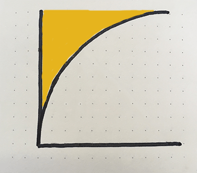
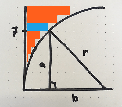
In the image below, I am trying to fill the orange area with rectangles.
Area outside of a circle
We will focus on the top left quadrant of the circle, but similar logic can be applied to the whole circle.
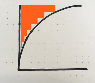
To fill the yellow corner area in the image on the left, we can fill the space with a series of rectangles to approximate the area, like in the image on the right.
area outside of the curve
area approximated with rectangles
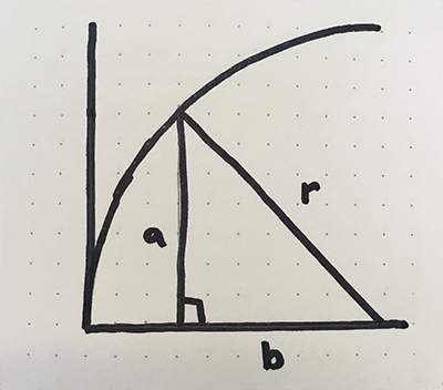
Find x and y coordinates along a curve
I would like to know the coordinates of each corner of each rectangle. The coordinates along the Y-axis are straight forward, but the coordinates along the curve will need some calculation.
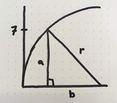
We can use the Pythagorean Theorem, from geometry, to determine the coordinates for the curve side of each rectangle. The Pythagorean Theorem states that given the length of 2 sides of a right triangle, we can determine the length of the third side. As an equation, this is: a2 + b2 = c2
When applied to a circle, c is our radius, so the equation can be rewritten as: a2 + b2 = r2
Pythagorean Theorem applied to a circle
In the image below, we can use the length of a to be the y coordinate. If we calculate the length of b, we can determine the x coordinate by subtracting b from the radius. In the drawing below, let’s calculate the x coordinate along the curve for when y is 7.
Plug the values into the equation and solve for b: a2 + b2 = r2 72 + b2 = 102 b2 = 102 – 72 b = √(102 – 72) b = √(100 – 49) b = √51 b = 7.14
b is 7.14 units long
Since we are filling the area outside of the circle, we need to do a bit of math to get the x coordinate. Since we know our radius is 10, we just subtract 7.14 from 10, which is 2.86. In the image below, that looks about right, the intersection of a and r is at about (2.86, 7).
Solving for x, our equation is: x = radius - √(radius2 - y2)
Determine the coordinates of all corners of the rectangles
Now that we know how to determine an x coordinate given our y coordinate, let’s translate that into rectangles. To get the rectangle coordinates, we need to know the height dimension of the rectangles. In our case, each rectangle is 1 unit high. We can calculate this with radius / desired number of rectangles. In the image below, the rectangles that correspond to y = 0, y = 1, and y = 3 were so small, I excluded them.
Let’s calculate the coordinates for the corners of the blue bar. By reading the dots on graph, we can determine most of the values:
Bottom Left:  (0,7)
Bottom Right: (?,7)
Top Left:     (0,8)
Top Right:    (?,8)
We can use the math we did above to determine our unknown values. Since the entire right side of the rectangle has the same x value, we can use the 2.86 for both corners.
Bottom Left:  (0,7)
Bottom Right: (2.86,7)
Top Left:     (0,8)
Top Right:    (2.86,8)
For the rectangle directly above the blue one:
Bottom Left:  (0,8)
Bottom Right: (?,8)
Top Left:     (0,9)
Top Right:    (?,9)
Solving for x in our equation, when y = 8: x = radius - √(radius2 - y2)
x = 10 – √(100 – 82) x = 10 – √(36) x = 10 – 6 x = 4
Our updated coordinates are:
Bottom Left:  (0,8)
Bottom Right: (4,8)
Top Left:     (0,9)
Top Right:    (4,9)
I will walk through adding a gradient border to a circular button in React Native. Here is a post on how to create a round button: Round Buttons in React Native
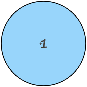
The final code will create a button that looks like this:
This code will generate a button that looks like this:
Circular button in React Native
Add gradient border
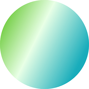
We will create 2 circles, one on top of the other. The background circle will be slightly larger and have the gradient applied. The circle in the foreground will be a solid color that will overlap the gradient one, except for on the edges, allowing the gradient to show through. Below is what the background circle looks like.
background circle
A couple of notes on the code
<LinearGradient> will apply the gradient, it is available in the expo-linear-gradient module. I haven’t tried it, but it appears you can use this module without Expo. Documentation can be found here: LinearGradient
The start and end props of the LinearGradient specify the angle of the gradient.
The colors specify the different colors to use, I like how 3 looks.
The size of the border is based on a ratio, and set in the gradientRatio function. I just played around with values to get something that I thought looked good.
We will reduce the size of the solid color circle based on the gradientRatio.
We remove the borderWidth from the button style because technically the button has no border now.
The margin of the solid color circle is equal to the half of the difference in circle sizes. This splits the size difference on all sides to center the circle.
I built a simple React Native application that includes round buttons. The design includes 1 large round button and 2 smaller ones nested in the corners.
Button layout
I ran into an issue where the corners of the containing element respond to clicks, even though it is outside of the circle.
In this post, I walk through creating a circular button where the corners don’t respond to clicks.
TLDR: You can jump to my final solution near the bottom of the page, here.
Problem – The corners can be clicked
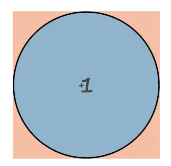
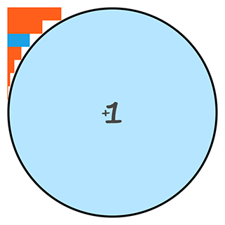
My first iteration of the circular button looked fine, but the TouchableOpacity element is a square, and the corners outside of the circle were still clickable. This is fine in smaller buttons where the entire element is a reasonable touch target, but in bigger buttons, the corner areas can be quite large.
As an example, the button below will register clicks in both the blue and orange areas. Ideally, only the blue area would register clicks.
This issue is compounded in my case because I am nesting additional buttons in the corners. This overlap will register big button clicks, when small button clicks are intended.
To start, we create a simple circular button that uses a TouchableOpacity element to register the touches. It will look like this:
The key to making the button round is to include a border radius that is at least 50% of the width and height.
To make it simple, I am passing in a circleDiameter prop that is used to calculate the height, width, and borderRadius. In order for the props to be used in the styles, we need to pass them into the styles as a parameter. I do this through the localStyles variable.
Here is the code for a simple circular button:
import React from 'react';
import { View, StyleSheet, TouchableOpacity } from 'react-native';

export default class SimpleCircleButton extends React.Component {
  render(){
    let localStyles = styles(this.props) //need to load styles with props because the styles rely on prop values

    return (
      <View style={localStyles.container}>
        <TouchableOpacity
          activeOpacity={.8} //The opacity of the button when it is pressed
          style = {localStyles.button}
          onPress = {this.props.onPress}
        >
          {this.props.children}
        </TouchableOpacity>
      </View>
    )
  }
}

const styles = (props) => StyleSheet.create({
  container: {
    position: 'relative',
    zIndex: 0,
    backgroundColor: 'rgba(255,95,28,0.42)', //add a background to highlight the touchable area
  },
  button: {
    backgroundColor: 'rgba(20,174,255,0.51)',
    justifyContent: 'center',
    alignContent: 'center',
    borderWidth: 3,
    borderRadius: (props.circleDiameter / 2),
    width: props.circleDiameter,
    height: props.circleDiameter,
  },
});
We can then add the circle like this:
//...Other code above
// The `onPress` function will be called when the button is pressed
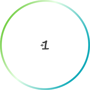
// The content of the <SimpleCircleButton> will be displayed in the button, in our case, an image that shows "+1".
<SimpleCircleButton
onPress = {() => props.addScore(1)}
circleDiameter = {300}
>
<Image source={ require('../assets/images/plus-1.png') } />
</SimpleCircleButton>
//...Other code below
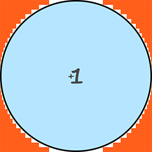
Using the code above, we get a button like the image below, where the orange and blue areas are clickable. Next we will make the orange area not clickable.
Round react native button. Orange area is still clickable.
2) Create corner masking
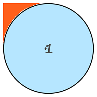
First, we will focus on the top left quadrant of the circle.
To prevent clicking in the orange corner area, we can fill the space with non-clickable elements the have a higher z-index (ios) or elevation (android). We can use a series of rectangles to approximate the area, like in the images below.
This is the equation we can use to calculate the width: width = radius - √(radius2 - height2)
Convert our equation to code
Now let’s update the SimpleCircleButton to include masking rectangles. We will start with 7 rectangles to keep it simple, but we will add more later. The more rectangles we have, the smaller the height of each one, which fits closer to the circle. However, we don’t want to hinder performance by adding too many. I used 13 in my app.
7 bars
50 bars
import React from 'react';
import { View, StyleSheet, TouchableOpacity } from 'react-native';

export default class SimpleCircleButton extends React.Component {
  constructor(props) {
    super(props)

    this.numberOfRectangles = 7

    // The style used for the rectangles
    // the zIndex and elevation of 10 puts the rectangles in front of the clickable button
    this.baseRectangleStyle = {
      position: 'absolute',
      zIndex: 10,
      elevation: 10,
    }
  }

  fillRectangle = (iteration) => {
    // The radius of a circle is the diameter divided by two
    const radius = this.props.circleDiameter / 2

    // base the height of each bar on the circle radius.
    // Since we are doing 1 quadrant at a time, we can just use the radius as the total height
    // Add 1 to the value b/c we will subtract one down below to get rid of the zero index
    const barHeight = radius / (this.numberOfRectangles + 1)

    // round the radius up, so get rid of fractional units
    const roundedRadius = Math.ceil(radius)

    // The y value is the height of our bars, * the number of bars we have already included
    const y = (barHeight * iteration)

    // here is where we apply our modified Pythagorean equation to get our x coordinate.
    const x = Math.ceil(Math.sqrt(Math.pow(radius, 2) - Math.pow(y, 2)))

    // Now get the width of the bar based on the radius.
    let width = roundedRadius - x

    // The bar dimensions
    const size = {
      width: width,
      height: barHeight
    };

    // The bar location. Since we are starting with the top left, we need to add the radius to the y value
    let location = {
      left: 0,
      bottom: y + roundedRadius,
    };

    // Add some colors to the bars. In our final version we won't do this.
    let color = '#FF5F1C'
    if(iteration === 5){ color = '#1da1e6' }

    // Create a unique key to identify the element
    // let key = "" + iteration + starting + color
    let key = "" + iteration + color

    return(
      <View key={key} style={{...this.baseRectangleStyle, backgroundColor: color, ...size, ...location}}></View>
    )
  };

  renderLines = () => {
    //start with index+1 b/c 0 will be a width of zero, so no point in doing that math
    return [...Array(this.numberOfRectangles)].map((_, index) => this.fillRectangle(index+1))
  }

  fillRectangles = () => {
    return(
      <React.Fragment>
         {this.renderLines()}
      </React.Fragment>
     )
   };

  render(){
    let localStyles = styles(this.props)

    return (
      <View style={localStyles.container}>
        <TouchableOpacity
          activeOpacity={.8}
          style = {localStyles.button}
          onPress = {this.props.onPress}
        >
          {this.props.children}
        </TouchableOpacity>

        {this.fillRectangles()}
      </View>
    )
  }
}

const styles = (props) => StyleSheet.create({
  container: {
    position: 'relative',
    zIndex: 0,
  },
  button: {
    backgroundColor: 'rgba(20,174,255,0.31)',
    justifyContent: 'center',
    alignContent: 'center',
    borderRadius: (props.circleDiameter / 2),
    borderWidth: 3,
    width: props.circleDiameter,
    height: props.circleDiameter,
  },
});
Running our updated code looks like the image below. The colored bars are not clickable, but the round button is. The blue bar is for reference back to our original drawing of bars.
Add bars to other quadrants
Now add the other quadrants.
Increase the numberOfRectangles to 15 to get a bitter circle fit
Add code to the constructor to reduce the math we do for each quadrant * iteration combination
Move the radius
Create a new variable fillRectangleHeight
Add a starting parameter to the fillRectangle. This specifies the quadrant to be displayed.
Add a new set of if statements that will set the location styles, depending upon the quadrant.
Add starting to the unique key
Add starting parameter to renderLines to be passed through to fillRectangle.
Add new calls to renderLines for each quadrant.
import React from 'react';
import {View, StyleSheet, TouchableOpacity } from 'react-native';

export default class SimpleCircleButton extends React.Component {
  constructor(props) {
    super(props)

//CHANGE VALUE
    this.numberOfRectangles = 15 //Define how many rectangles we want

//START NEW CODE
    // The radius of a circle is the diameter divided by two
    this.radius = this.props.circleDiameter / 2

    // base the height of each bars on the circle radius.
    // Since we are doing 1 quadrant at a time, we can just use the radius as the total height
    // Add 1 to the value b/c we will subtract one down below to get rid of the zero index
    this.fillRectangleHeight = this.radius / (this.numberOfRectangles + 1)
//END NEW CODE

    // The style used for the rectangles
    // the zIndex and elevation of 10 puts the rectangles in front of the clickable button
    this.baseRectangleStyle = {
      position: 'absolute',
      zIndex: 10,
      elevation: 10,
    }
  }

// ADD a new `starting` parameter here to represent the quadrant we are working on
  fillRectangle = (iteration, starting) => {

//CODE REMOVED HERE

    const barHeight = this.fillRectangleHeight

    // round the radius up, so get rid of fractional units
    const roundedRadius = Math.ceil(this.radius)

    // The y value is the height of our bars, * the number of bars we have already included
    const y = (barHeight * iteration)

    // here is where we apply our modified Pythagorean equation to get our x coordinate.
    const x = Math.ceil(Math.sqrt(Math.pow(this.radius, 2) - Math.pow(y, 2)))

    // Now get the width of the bar based on the radius.
    let width = roundedRadius - x

    // The bar dimensions
    const size = {
      width: width,
      height: barHeight
    };

    // The bar location. Since we are starting from the middle, working out way out, we need to add the radius to y
// START NEW CODE - depending on the quadrant, change the location
    const verticalLocation = y + roundedRadius

    let location = {}
    if(starting === 'topLeft'){
      location = {
        left: 0,
        bottom: verticalLocation,
      };
    }else if(starting === 'bottomLeft'){
      location = {
        left: 0,
        top: verticalLocation,
      }
    }else if(starting === 'topRight'){
      location = {
        right: 0,
        top: verticalLocation,
      }
    }else if(starting === 'bottomRight'){
      location = {
        right: 0,
        bottom: verticalLocation,
      }
    };
//END NEW CODE

    // Add some colors to the bars. In our final version we won't do this.
    let color = '#FF5F1C'

    // Create a unique key to identify the element
    let key = "" + iteration + starting + color

    return(
      <View key={key} style={{...this.baseRectangleStyle, backgroundColor: color, ...size, ...location}}></View>
    )
  };

//START NEW CODE
  renderLines = (starting) => {
    //start with index+1 b/c 0 will be a width of zero, so no point in doing that math
    return [...Array(this.numberOfRectangles)].map((_, index) => this.fillRectangle(index+1, starting))
  }
//END NEW CODE

  fillRectangles = () => {
    return(
      <React.Fragment>
        {/*START NEW CODE*/}
        {this.renderLines('topLeft')}
        {this.renderLines('bottomLeft')}
        {this.renderLines('topRight')}
        {this.renderLines('bottomRight')}
        {/*END NEW CODE*/}
      </React.Fragment>
     )
   };

  render(){
    let localStyles = styles(this.props)

    return (
      <View style={localStyles.container}>
        <TouchableOpacity
          activeOpacity={.8}
          style = {localStyles.button}
          onPress = {this.props.onPress}
        >
          {this.props.children}
        </TouchableOpacity>

        {this.fillRectangles()}
      </View>
    )
  }
}

const styles = (props) => StyleSheet.create({
  container: {
    position: 'relative',
    zIndex: 0,
  },
  button: {
    backgroundColor: 'rgba(20,174,255,0.31)',
    justifyContent: 'center',
    alignContent: 'center',
    borderRadius: (props.circleDiameter / 2),
    borderWidth: 3,
    width: props.circleDiameter,
    height: props.circleDiameter,
  },
});
Running this new code results in the image below
All 4 quadrants filled in
TLDR: Final Code
Remove some comments and the bar coloring to clean up the code.
import React from 'react';
import {View, StyleSheet, TouchableOpacity } from 'react-native';

export default class SimpleCircleButton extends React.Component {
  constructor(props) {
    super(props)

    this.numberOfRectangles = 15
    this.radius = this.props.circleDiameter / 2

    // base the height of each bars on the circle radius.
    // Add 1 to the value b/c we will subtract one down below to get rid of the zero index
    this.fillRectangleHeight = this.radius / (this.numberOfRectangles + 1)

    // The style used for the rectangles
    // the zIndex and elevation of 10 puts the rectangles in front of the clickable button
    this.baseRectangleStyle = {
      position: 'absolute',
      zIndex: 10,
      elevation: 10,
    }
  }

  fillRectangle = (iteration, starting) => {
    const barHeight = this.fillRectangleHeight
    const roundedRadius = Math.ceil(this.radius)
    const y = (barHeight * iteration)

    const x = Math.ceil(Math.sqrt(Math.pow(this.radius, 2) - Math.pow(y, 2)))

    let width = roundedRadius - x

    // The bar dimensions
    const size = {
      width: width,
      height: barHeight
    };

    const verticalLocation = y + roundedRadius

    let location = {}
    if(starting === 'topLeft'){
      location = {
        left: 0,
        bottom: verticalLocation,
      };
    }else if(starting === 'bottomLeft'){
      location = {
        left: 0,
        top: verticalLocation,
      }
    }else if(starting === 'topRight'){
      location = {
        right: 0,
        top: verticalLocation,
      }
    }else if(starting === 'bottomRight'){
      location = {
        right: 0,
        bottom: verticalLocation,
      }
    };

    // Create a unique key to identify the element
    let key = "" + iteration + starting

    return(
      <View key={key} style={{...this.baseRectangleStyle, ...size, ...location}}></View>
    )
  };

  renderLines = (starting) => {
    //start with index+1 b/c 0 will be a width of zero, so no point in doing that math
    return [...Array(this.numberOfRectangles)].map((_, index) => this.fillRectangle(index+1, starting))
  }

  fillRectangles = () => {
    return(
      <React.Fragment>
        {this.renderLines('topLeft')}
        {this.renderLines('bottomLeft')}
        {this.renderLines('topRight')}
        {this.renderLines('bottomRight')}
      </React.Fragment>
     )
   };

  render(){
    let localStyles = styles(this.props)

    return (
      <View style={localStyles.container}>
        <TouchableOpacity
          activeOpacity={.8}
          style = {localStyles.button}
          onPress = {this.props.onPress}
        >
          {this.props.children}
        </TouchableOpacity>

        {this.fillRectangles()}
      </View>
    )
  }
}

const styles = (props) => StyleSheet.create({
  container: {
    position: 'relative',
    zIndex: 0,
  },
  button: {
    backgroundColor: 'rgba(20,174,255,0.31)',
    justifyContent: 'center',
    alignContent: 'center',
    borderRadius: (props.circleDiameter / 2),
    borderWidth: 3,
    width: props.circleDiameter,
    height: props.circleDiameter,
  },
});
The cleaned up code will create a button like this
Final button
Limitations
There are a few limitations to consider
The bars don’t cover 100% of the space outside of the circle, but it is close enough for registering or not registering touch events.
If the number of bars is high, or the button is rerendered a lot, this code may not be super performant. In my production version, I only render the quadrants that are close to other elements that respond to touch. You could add configuration to conditionally render the quadrants based on a prop value