Introduction
I will walk through adding a gradient border to a circular button in React Native. Here is a post on how to create a round button: Round Buttons in React Native
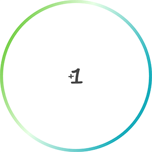
The final code will create a button that looks like this:
Features
- Dynamic border based on circle radius
- Dynamic border with color gradient as a prop
- Gradient is displayed over full button on click.
Walkthrough
Create a simple round button
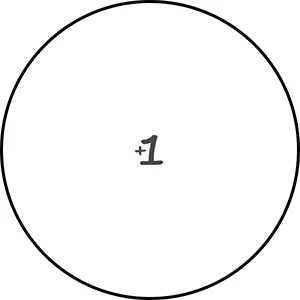
As a starting point, here is code to create a round button:
import React from 'react';
import {View, StyleSheet, TouchableOpacity } from 'react-native';

export default class CircleButton extends React.Component {
  render(){
    let localStyles = styles(this.props)

    return (
      <View style={localStyles.container}>
        <TouchableOpacity
          activeOpacity={.8}
          style = {localStyles.button}
          onPress = {this.props.onPress}
        >
          {this.props.children}
        </TouchableOpacity>
      </View>
    )
  }
}

const styles = (props) => StyleSheet.create({
  container: {
    position: 'relative',
    zIndex: 0,
  },
  button: {
    backgroundColor: 'white',
    justifyContent: 'center',
    alignContent: 'center',
    borderWidth: 3,
    borderRadius: (props.circleDiameter / 2),
    width: props.circleDiameter,
    height: props.circleDiameter,
  },
});
And here is how to call it
//...other code

<CircleButton
  onPress = {() => props.addScore(1)}
  circleDiameter = {300}
>
  <Image source={ require('../assets/images/plus-1.png') }/>
</CircleButton>

//...other code
This code will generate a button that looks like this:
Add gradient border
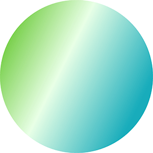
We will create 2 circles, one on top of the other. The background circle will be slightly larger and have the gradient applied. The circle in the foreground will be a solid color that will overlap the gradient one, except for on the edges, allowing the gradient to show through. Below is what the background circle looks like.
A couple of notes on the code
<LinearGradient>will apply the gradient, it is available in theexpo-linear-gradientmodule. I haven’t tried it, but it appears you can use this module withoutExpo. Documentation can be found here: LinearGradient- The
startandendprops of theLinearGradientspecify the angle of the gradient. - The
colorsspecify the different colors to use, I like how 3 looks. - The size of the border is based on a ratio, and set in the
gradientRatiofunction. I just played around with values to get something that I thought looked good. - We will reduce the size of the solid color circle based on the
gradientRatio. - We remove the
borderWidthfrom thebuttonstyle because technically the button has no border now. - The
marginof the solid color circle is equal to the half of the difference in circle sizes. This splits the size difference on all sides to center the circle.
import React from 'react';
import {View, StyleSheet, TouchableOpacity } from 'react-native';

import { LinearGradient } from "expo-linear-gradient";

export default class CircleButton extends React.Component {
  render(){
    let localStyles = styles(this.props)

    return (
      <View style={localStyles.container}>

        <LinearGradient
          start={[1, 0.5]}
          end={[0, 0]}
          colors={this.props.gradientColors}
          style={localStyles.linearGradient}
        >
          <TouchableOpacity
            activeOpacity={.8}
            style = {localStyles.button}
            onPress = {this.props.onPress}
          >
            {this.props.children}
          </TouchableOpacity>
        </LinearGradient>
      </View>
    )
  }
}

const gradientMargin = (circleDiameter) => {
  const ratio = (1 - gradientRatio(circleDiameter)) / 2

  return circleDiameter * ratio
}

const gradientRatio = (circleDiameter) => {
  if(circleDiameter < 100){
    return 0.88
  }else{
    return 0.96
  }
}

const styles = (props) => StyleSheet.create({
  container: {
    position: 'relative',
    zIndex: 0,
  },
  linearGradient: {
    borderRadius: props.circleDiameter / 2,
    width: props.circleDiameter,
    height: props.circleDiameter,
  },
  button: {
    margin: gradientMargin(props.circleDiameter),
    backgroundColor: 'white',
    justifyContent: 'center',
    alignContent: 'center',
    borderRadius: (props.circleDiameter / 2) * gradientRatio(props.circleDiameter),
    width: props.circleDiameter * gradientRatio(props.circleDiameter),
    height: props.circleDiameter * gradientRatio(props.circleDiameter),
  },
});
Now add the gradient prop to where we include the <CircleButton>
//...other code

<CircleButton
  onPress = {() => props.addScore(1)}
  circleDiameter = {300}
  gradientColors = {['#18acbb', '#e8ffe6', '#4abb0b']}
>
  <Image source={ require('../assets/images/plus-1.png') } />
</CircleButton>

//...other code
The resulting button looks like this: