Chess with children

Introduction

My 6 year old nephew recently learned how to play chess. He knows how each piece can move, and he knows the basic strategy of how to win. So far, I am a much stronger player than him, and I would like to foster his learning, and love for the game.

Letting him win?

I enjoy playing with him, but I am conflicted on whether or not I should let him capture my pieces, or beat me.

Children are perceptive and can sense when adults are not playing to their full potential, which can ultimately undermine their sense of accomplishment and confidence in their abilities. Here are some reasons why:

  1. Children learn from their mistakes
    Losing a game can be a valuable learning experience for a child, as it can help them identify areas for improvement and develop their strategic thinking skills. If you always let them win, they may not learn as much from the game.
  2. It builds resilience
    Learning to lose and recover from setbacks is an important life skill, and chess can be a great way for children to develop resilience and persistence in the face of challenges.
  3. It promotes fairness
    Chess is a game of skill, and it is important for children to learn that winning requires effort and practice. Letting them win without earning it can create a sense of entitlement and undermine the fairness of the game.

I think that the day that he legitimately beats me (and I am sure he will), will be a great day for him, and it will feel like a true accomplishment. 

Strategies to even the playing field

There are several ways to even the playing field when playing with a less experienced player.

  1. Give the weaker player more time
    If using a timer, allow the weaker player more time, or limit the stronger player’s time per move.
  2. Play with imbalanced material
    The stronger player can start with fewer pieces. For example, you could give the weaker player an extra queen, or the stronger player could start without a knight.
  3. Limit the possible pieces the stronger player can move
    Each turn, randomly select a few pieces that the stronger player is allowed to move.

For the third option, there are several ways this can be accomplished:

  1. Equalizer Chess Dice
    The stronger player rolls dice to determine which pieces they are allowed to move.
  2. Regular dice
    The stronger player rolls 2 normal dice, where the numbers correspond to pieces they are allowed to move.
    1 = pawn, 2 = knight, 3 = bishop, 4 = rook, 5 = queen, 6 = king
  3. Chess Equalizer
    A free iOS app I created which randomly selects the pieces you are allowed to move.
    Download here.
    The app has several features that the other approaches don’t.
    1. Removes eliminated pieces from the random selection
    2. Is configurable, so as the weaker player gets stronger, the stronger player can select their move from more possible pieces.
Screenshot from Chess Equalizer, showing how pieces are presented.

I like to have the app visible to both of us, so he knows that I am limiting my moves, and that we are playing in an uneven way. 

A huge benefit is that the game is challenging and fun for me. I can play at my full strength and he still has a chance to capture pieces and win.

One issue with limiting my pieces is that it adds a bit a chance to the game, where he may have pieces that are threatened that he doesn’t have to protect each turn. It is a gamble if my threatening piece is allowed to move the next turn.

Conclusion

I have really enjoyed playing with him, and think it has several benefits to him:

  1. Improves his chess skills
    Playing with an adult can challenge children to improve their chess skills, as adults can provide feedback and guidance on strategic thinking and game play.
  2. Learn new strategies
    Adults have more experience with the game and can teach children new strategies and techniques to improve their game.
  3. Develop critical thinking skills
    Chess is a game of critical thinking, and playing with an adult can help children develop their critical thinking skills as they learn to analyze different moves and anticipate their opponent’s next move.
  4. Build social skills
    Chess is a social game and playing with an adult can help children develop social skills such as communication, sportsmanship, and respect for others.
  5. Bonding opportunity
    Playing chess with an adult can be a fun and engaging way to bond with them and create positive memories together.

I am excited to see his chess skills improve, and I hope it is a game we can enjoy together for many years.

Setting up Firebase Analytics for React Native iOS app built in Expo

(Updated 8/12/23)

According to the Expo docs, you cannot run Firebase Analytics alongside Expo Go. I think this is misleading, because in my experience, you can get Analytics running, you just can’t call it from within Expo Go. You can call Analytics from apps built with eas, which is likely what you are running in production anyway.

Here are the steps I took to set up Firebase Analytics for iOS. I am not sure if this will work for Android builds.

Installing packages

You will need to install several packages from your command line.

> npx expo install expo-dev-client
> npx expo install expo-build-properties
> npx expo install @react-native-firebase/app @react-native-firebase/analytics @react-native-firebase/perf @react-native-firebase/crashlytics

Create your Firebase project

Add a new project from the Firebase console: https://console.firebase.google.com/u/0/

Enter your project name

Make sure you select “Enable Google Analytics for this project”. You may have to go through additional setup if you haven’t previously used Google Analytics.

Select the Analytics account, and press Create Project:

Configure your Firebase project

Once the project is created, select it from the dashboard if you aren’t already on the project page.

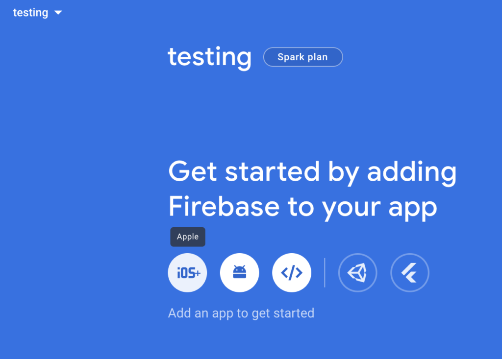
Now, select the iOS option from “Get started by adding Firebase to your app” page.

There are several steps on the page, but you only need to do the first couple.

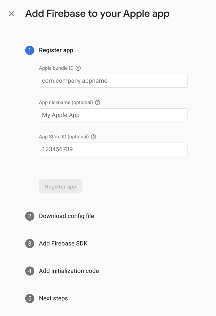
Register your app

You can find your Bundle ID in the bundleIdentifier field of the app.json

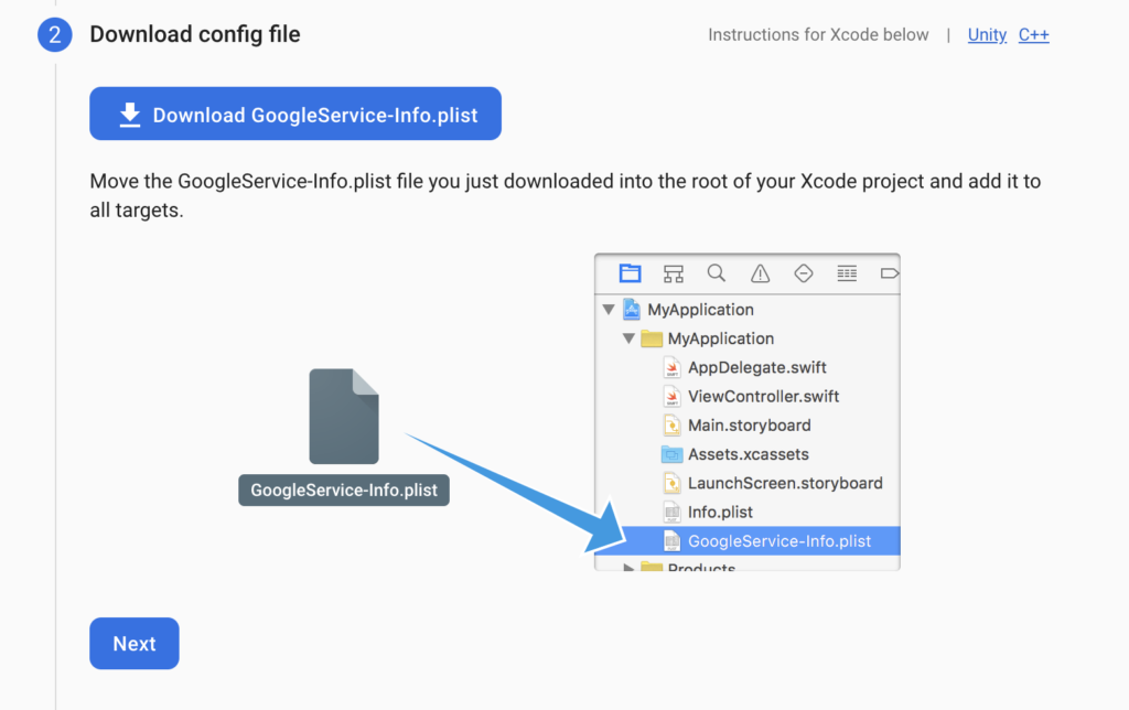
Download the GoogleService-Info.plist file

Put the file in the root directory of your project. This should probably not be checked into Git, but I don’t think it is too critical.

You can skip the rest of the steps on the page (SDK, initialization)

App Configuration

You need to add a couple of items to your app.json file.

"ios": {
      <...other setup if present>
      "googleServicesFile": "./GoogleService-Info.plist"
},
"plugins": [
      <...other setup if present>
      "@react-native-firebase/app",
      "@react-native-firebase/perf",
      "@react-native-firebase/crashlytics",
      [
          "expo-build-properties",
          {
              "ios": {
              "useFrameworks": "static"
              }
          }
      ]
],

Calling Firebase from React Native code

Expo Go cannot load @react-native-firebase/analytics, so create a wrapper file that will conditionally load it if we aren’t running the app in Expo Go. The code below includes a function logLevelComplete, that takes two parameters: level and moves, and logs a custom event called level_complete.

import Constants, { ExecutionEnvironment } from 'expo-constants'

// `true` when running in Expo Go.
const isExpoGo = Constants.executionEnvironment === ExecutionEnvironment.StoreClient

let analytics
if (!isExpoGo) {
  // eslint-disable-next-line @typescript-eslint/no-var-requires
  analytics = require('@react-native-firebase/analytics').default
}

export async function logLevelComplete(level: number, moves: number) {
  if (isExpoGo) {
    console.log(
      'levelComplete analytics event, level: ',
      level,
      'moves: ',
      moves
    )
  } else {
    await analytics().logEvent('level_complete', { level: level, moves: moves })
  }
}

Now, you can log events by calling the functions you create in firebaseWrapper.ts. If you are running in Expo Go, it will log the event to the console, if you are running the app through an eas build, it will send the Firebase events to Firebase.

Running in Expo Go with the simulator

Prior to Expo 49

You can run Expo Go as you normally would, but you will see a warning in your logs that indicates the build is not installed in your simulator, you can ignore this warning.

The expo-dev-client package is installed, but a development build is not installed on iPhone 12 mini.
Launching in Expo Go. If you want to use a development build, you need to create and install one first.
Learn more

Expo 49

In Expo 49, npx expo start will default to development builds rather than Expo Go if expo-dev-client is installed.

To force Expo Go to be used, launch with: npx expo start --go --clear

If you don’t, you will get an error like the one below, and the app won’t launch. You can also switch to Go by pressing s:

› Opening on iOS...
CommandError: No development build (<appname>) for this project is installed. Please make and install a development build on the device first.
Learn more

If you want to run the application natively, and not through Expo Go, I think you will need to build a preview version of the app through the eas command. This takes a while to compile, and doesn’t work for my workflow. I believe these instructions will help you get that set up, but I haven’t tried it: https://docs.expo.dev/develop/development-builds/create-a-build/#create-a-build-for-emulatorsimulator

Running on your device

To test that the Firebase integration is working, create an eas preview build, with a command like:
eas build --profile preview --platform ios --clear-cache

Once the build is done, install it on your device. Within your app, do whatever action will trigger the event call you set up.

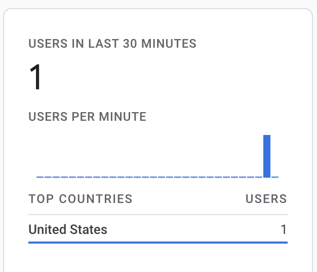
If you go to the Firebase dashboard, you should see a count in the Users in last 30 minutes section after a minute or two.

The events take up to 24 hours to show up in Firebase, so be patient.

References

Expo installation guide: https://docs.expo.dev/guides/using-firebase/#using-react-native-firebase

Firebase setup guide: https://rnfirebase.io/#managed-workflow

Firebase console: https://console.firebase.google.com/u/0/

Using hooks and context with SQLite for Expo in React Native

In this post, I discuss how I have set up SQLite in my Expo app. I utilize hooks and functional components to make my code reusable and modular.

I really like this post, which goes into great detail about using SQLite in a non-Expo setting: https://brucelefebvre.com/blog/2020/05/03/react-native-offline-first-db-with-sqlite-hooks/

This post assumes you have a working Expo React Native project, and that you are somewhat familiar with contexts, hooks, and state in React Native. I will show code that will manage a list of users, using a database, hooks with state, and a context.

To do the initial setup for SQLite, run:

expo install expo-sqlite

Overview

  1. Set up file for all of the DB queries
  2. Set up a hook to initialize the database
  3. Set up a context for managing users
  4. Use the context in components

Set up DB Queries

I like to keep my queries in a single file, this way, if I ever want to move off of SQLite, or mock out the DB for tests, I can swap out a single file.

Below is my code that will create our db tables, initialize the users db, get users, insert users. In addition, there is function to drop the db tables, which is helpful during development and test.

import React from 'react'

import * as SQLite from "expo-sqlite"

const db = SQLite.openDatabase('db.db')

const getUsers = (setUserFunc) => {
  db.transaction(
    tx => {
      tx.executeSql(
        'select * from users',
        [],
        (_, { rows: { _array } }) => {
          setUserFunc(_array)
        }
      );
    },
    (t, error) => { console.log("db error load users"); console.log(error) },
    (_t, _success) => { console.log("loaded users")}
  );
}

const insertUser = (userName, successFunc) => {
  db.transaction( tx => {
      tx.executeSql( 'insert into users (name) values (?)', [userName] );
    },
    (t, error) => { console.log("db error insertUser"); console.log(error);},
    (t, success) => { successFunc() }
  )
}

const dropDatabaseTablesAsync = async () => {
  return new Promise((resolve, reject) => {
    db.transaction(tx => {
      tx.executeSql(
        'drop table users',
        [],
        (_, result) => { resolve(result) },
        (_, error) => { console.log("error dropping users table"); reject(error)
        }
      )
    })
  })
}

const setupDatabaseAsync = async () => {
  return new Promise((resolve, reject) => {
    db.transaction(tx => {
        tx.executeSql(
          'create table if not exists users (id integer primary key not null, name text);'
        );
      },
      (_, error) => { console.log("db error creating tables"); console.log(error); reject(error) },
      (_, success) => { resolve(success)}
    )
  })
}

const setupUsersAsync = async () => {
  return new Promise((resolve, _reject) => {
    db.transaction( tx => {
        tx.executeSql( 'insert into users (id, name) values (?,?)', [1, "john"] );
      },
      (t, error) => { console.log("db error insertUser"); console.log(error); resolve() },
      (t, success) => { resolve(success)}
    )
  })
}

export const database = {
  getUsers,
  insertUser,
  setupDatabaseAsync,
  setupUsersAsync,
  dropDatabaseTablesAsync,
}

Some things to note about the code

  1. const db = SQLite.openDatabase('db.db') opens the database named db.db.
  2. The dropDatabaseTablesAsync, setupDatabaseAsync, and setupUsersAsync are asynchronous functions that return a promise. This means that we can call those functions with await. We will call these functions while showing the splash screen, waiting for the tasks to be finished before we move on.
  3. The last 2 parameters of the db.transaction are the error and success functions, which are called when the transaction is complete. We use the promise resolve and reject functions here. I found this article helpful: https://medium.com/@theflyingmantis/async-await-react-promise-testing-a0d454b5461b
  4. The other functions aren’t asynchronous because we don’t really need to wait for them to finish.
  5. For getUsers, we pass in a function that takes the array that the query returns as its parameter. We will pass in a function that can take the users from the query and set the state.
  6. For insertUser, we pass in a successFunc that will be called after the insert has happened. In our case, we are passing in the function to refresh the users from the database. This way we know that our state will reflect what is in the database.
  7. At the bottom of the file, we are exporting the functions so we can use them in other components.

The useDatabase Hook

When the app starts up, we want to set up the database tables if they haven’t already been setup, and insert some initial data. When working in dev, we may want to drop the existing tables to start clean, so we include a function call for that, which we can comment out in prod.

Here is the code, we put this file in the hooks directory. Hooks are a convenient location for code that can be called from functional components.

// force the state to clear with fast refresh in Expo
// @refresh reset
import React, {useEffect} from 'react';

import {database} from '../components/database'

export default function useDatabase() {
  const [isDBLoadingComplete, setDBLoadingComplete] = React.useState(false);

  useEffect(() => {
    async function loadDataAsync() {
      try {
        await database.dropDatabaseTablesAsync()
        await database.setupDatabaseAsync()
        await database.setupUsersAsync()

        setDBLoadingComplete(true);
      } catch (e) {
        console.warn(e);
      }
    }

    loadDataAsync();
  }, []);

  return isDBLoadingComplete;
}

Some notes on this code:

  1. The component manages its own state (isDBLoadingComplete) to indicate when the database loading is complete.
  2. We put the code within the useEffect function so that it is called when the component is loaded. By including the [] as the second parameter, we only call this function on the initial render.
  3. The await calls will run in order, and will only move on to the next line when the function has returned.
  4. After all of the database setup functions are called and have returned, we will set the state to indicate that the loading is complete. We will be watching for this state value in the App.js to know when we can hide the splash screen and show the homescreen.
  5. The // @refresh reset comment will force the state to be cleared when the app refreshes in Expo.

Initializing the Database

We only want to initialize the database when the application first starts, and since the app can’t really work without the database, we should show the splash screen until the initialization is done. We can do this in the App.js file.

Since the useEffect function within useDatabase is asynchronous, we can’t guarantee that it will return right away. We set it up to track a state flag indicating when it is done, so the code in our App.js will watch for that flag.

Here is the relevant code in the App.js.

import React from 'react';
import { View } from 'react-native';

import * as SplashScreen from 'expo-splash-screen';

import useDatabase from './hooks/useDatabase'
import useCachedResources from './hooks/useCachedResources';

export default function App(props) {
  SplashScreen.preventAutoHideAsync(); //don't let the splash screen hide

  const isLoadingComplete = useCachedResources();
  const isDBLoadingComplete = useDatabase();

  if (isLoadingComplete && isDBLoadingComplete) {
    SplashScreen.hideAsync();

    return (
      <View>
        ...Render the app stuff here...
      </View>
    );
  } else {
    return null;
  }
}

Some notes in the code

  1. Notice we hide the splash screen with SplashScreen.hideAsync() only when both loading flags are true.
  2. The useCachedResources is part of the Expo boilerplate.
  3. The App may return null a few times before the database and cached resources are done loading.

Context for user data

The app will need to have access the user data from multiple screens.

In the example code, we have 2 tabs:

  • HomeScreen – showing the list of users, with an input field to add users.
  • UserListScreen – showing the list of users

Both tabs need to be updated with the new user list when a user is inserted. To do this, we can store the user data and functions in a context: https://reactjs.org/docs/context.html

Contexts shouldn’t be used for all data, but if you need to share data across many components, sometimes deeply nested, it might be a good solution.

The code below was inspired by this post: https://www.codementor.io/@sambhavgore/an-example-use-context-and-hooks-to-share-state-between-different-components-sgop6lnrd

// force the state to clear with fast refresh in Expo
// @refresh reset

import React, { useEffect, createContext, useState } from 'react';
import {database} from '../components/database'

export const UsersContext = createContext({});

export const UsersContextProvider = props => {
  // Initial values are obtained from the props
  const {
    users: initialUsers,
    children
  } = props;

  // Use State to store the values
  const [users, setUsers] = useState(initialUsers);

  useEffect(() => {
    refreshUsers()
  }, [] )

  const addNewUser = userName => {
    return database.insertUser(userName, refreshUsers)
  };

  const refreshUsers = () =>  {
    return database.getUsers(setUsers)
  }

  // Make the context object:
  const usersContext = {
    users,
    addNewUser
  };

  // pass the value in provider and return
  return <UsersContext.Provider value={usersContext}>{children}</UsersContext.Provider>;
};

Some notes on the code

  1. This will create the Context and Provider. We could have also created a Consumer, but since we are using the useContext function, we don’t need it.
  2. Within the addNewUser and refreshUsers functions, we are making our database calls.
    1. In refreshUsers we are sending the setUsers function, which will allow the query to set our local state.
    2. In addNewUser we are sending the refreshUsers function to refresh our state from the database.
  3. We have a useEffect call to instantiate the users list from the database. We only call this function on the first render.
  4. We are set up to take an initial state through props when we create the UsersContextProvider, but those values are quickly overwritten with the useEffect call. I left the code here for reference.

Setting up the Provider

In order to make the context available to the HomeScreen and UserListScreen, we need to wrap a common parent component in the context Provider. This will be done in the App.js.

import {UsersContextProvider} from './context/UsersContext'
.
.
.
<UsersContextProvider>
  < parent of HomeScreen and UserListScreen components goes here>
</UsersContextProvider>

Here is the complete App.js file, which is mostly boilerplate from initializing the Expo app.

import { NavigationContainer } from '@react-navigation/native';
import { createStackNavigator } from '@react-navigation/stack';
import React from 'react';
import { Platform, StatusBar, StyleSheet, View } from 'react-native';

import * as SplashScreen from 'expo-splash-screen';

import useDatabase from './hooks/useDatabase'
import useCachedResources from './hooks/useCachedResources';

import {UsersContextProvider} from './context/UsersContext'

import BottomTabNavigator from './navigation/BottomTabNavigator';
import LinkingConfiguration from './navigation/LinkingConfiguration';

const Stack = createStackNavigator();

export default function App(props) {
  SplashScreen.preventAutoHideAsync();

  const isLoadingComplete = useCachedResources();
  const isDBLoadingComplete = useDatabase();

  if (isLoadingComplete && isDBLoadingComplete) {
    SplashScreen.hideAsync();

    return (
      <View style={styles.container}>
        {Platform.OS === 'ios' && <StatusBar barStyle="dark-content" />}
        <UsersContextProvider>
          <NavigationContainer linking={LinkingConfiguration} >
            <Stack.Navigator>
              <Stack.Screen name="Root" component={BottomTabNavigator} />
            </Stack.Navigator>
          </NavigationContainer>
        </UsersContextProvider>
      </View>
    );
  } else {
    return null;
  }
}

const styles = StyleSheet.create({
  container: {
    flex: 1,
    backgroundColor: '#fff',
  }
});

Accessing the context from a component

To access the context, we use the useContext function, passing in our desired context. In the case of the UserListScreen.js, we just need the users, which we then render within our return call.

import React, {useContext} from 'react';
import {StyleSheet, Text} from 'react-native';
import { ScrollView } from 'react-native-gesture-handler';

import {UsersContext } from '../context/UsersContext'

export default function UserListScreen() {
  const { users } = useContext(UsersContext)

  return (
    <ScrollView style={styles.container}>
      <Text>Here is our list of users</Text>
      {users.map((user) => (
        <Text key={user.id}>{user.name}</Text>
      ))}
    </ScrollView>
  );
}

const styles = StyleSheet.create({
  container: {
    flex: 1,
    backgroundColor: '#fafafa',
  },
});

We do something similar in the HomeScreen.js, but we also import the function to add a new name: addNewUser.

import React, {useState, useContext} from 'react';
import { StyleSheet, Button, Text, TextInput, View } from 'react-native';

import {UsersContext} from '../context/UsersContext'

export default function HomeScreen() {
  const [ name, setName ] = useState(null);

  const usersContext = useContext(UsersContext)
  const { users, addNewUser } = usersContext;

  const insertUser = () => {
    addNewUser(name)
  }

  return (
    <View style={styles.container}>
      <Text>Our list of users</Text>
      {users.map((user) => (
        <Text key={user.id}>{user.name}</Text>
      ))}

      <TextInput
        style= { styles.input }
        onChangeText={(name) => setName(name)}
        value={name}
        placeholder="enter new name..."
      />
      <Button title="insert user" onPress={insertUser}/>
    </View>
  );
}

HomeScreen.navigationOptions = {
  header: null,
};

const styles = StyleSheet.create({
  input: {
    margin: 15,
    padding: 10,
    height: 40,
    borderColor: '#7a42f4',
    borderWidth: 1,
  },
  container: {
    flex: 1,
    backgroundColor: '#fff',
  },
});

Conclusion

I think this set up will allow me to easily re-use the database related code, without much overhead in each component that needs the data.

I am not certain that having the users and the functions to set the uses in a context is the best approach, but it seems appropriate for my small use case.

Using Rectangles to Fill the Area Outside of a Circle

Introduction

I am trying to create a series of rectangles to fill the area outside of a circle. I am doing this to solve a problem I ran into building a simple React Native app: Hashmarks

Here is a post explaining that problem: Round Buttons in React Native

In the image below, I am trying to fill the orange area with rectangles.

Area outside of a circle

We will focus on the top left quadrant of the circle, but similar logic can be applied to the whole circle.

To fill the yellow corner area in the image on the left, we can fill the space with a series of rectangles to approximate the area, like in the image on the right.

Find x and y coordinates along a curve

I would like to know the coordinates of each corner of each rectangle. The coordinates along the Y-axis are straight forward, but the coordinates along the curve will need some calculation.

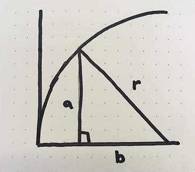
We can use the Pythagorean Theorem, from geometry, to determine the coordinates for the curve side of each rectangle. The Pythagorean Theorem states that given the length of 2 sides of a right triangle, we can determine the length of the third side.
As an equation, this is: a2 + b2 = c2

When applied to a circle, c is our radius, so the equation can be rewritten as: a2 + b2 = r2

Pythagorean Theorem applied to a circle

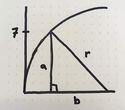
In the image below, we can use the length of a to be the y coordinate. If we calculate the length of b, we can determine the x coordinate by subtracting b from the radius. In the drawing below, let’s calculate the x coordinate along the curve for when y is 7.

Plug the values into the equation and solve for b:
a2 + b2 = r2
72 + b2 = 102
b2 = 102 – 72
b = √(102 – 72)
b = √(100 – 49)
b = √51
b = 7.14

b is 7.14 units long

Since we are filling the area outside of the circle, we need to do a bit of math to get the x coordinate. Since we know our radius is 10, we just subtract 7.14 from 10, which is 2.86. In the image below, that looks about right, the intersection of a and r is at about (2.86, 7).

Solving for x, our equation is:
x = radius - √(radius2 - y2)

Determine the coordinates of all corners of the rectangles

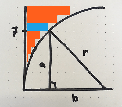
Now that we know how to determine an x coordinate given our y coordinate, let’s translate that into rectangles. To get the rectangle coordinates, we need to know the height dimension of the rectangles. In our case, each rectangle is 1 unit high. We can calculate this with radius / desired number of rectangles. In the image below, the rectangles that correspond to y = 0, y = 1, and y = 3 were so small, I excluded them.

Let’s calculate the coordinates for the corners of the blue bar. By reading the dots on graph, we can determine most of the values:


Bottom Left:  (0,7)
Bottom Right: (?,7)
Top Left:     (0,8)
Top Right:    (?,8)

We can use the math we did above to determine our unknown values. Since the entire right side of the rectangle has the same x value, we can use the 2.86 for both corners.


Bottom Left:  (0,7)
Bottom Right: (2.86,7)
Top Left:     (0,8)
Top Right:    (2.86,8)

For the rectangle directly above the blue one:


Bottom Left:  (0,8)
Bottom Right: (?,8)
Top Left:     (0,9)
Top Right:    (?,9)

Solving for x in our equation, when y = 8: x = radius - √(radius2 - y2)

x = 10 – √(100 – 82)
x = 10 – √(36)
x = 10 – 6
x = 4

Our updated coordinates are:


Bottom Left:  (0,8)
Bottom Right: (4,8)
Top Left:     (0,9)
Top Right:    (4,9)

Which looks about right:

Gradient Border on Circular Button in React Native

Introduction

I will walk through adding a gradient border to a circular button in React Native. Here is a post on how to create a round button: Round Buttons in React Native

The final code will create a button that looks like this:

React Native circular button with gradient border.
React Native circular button with gradient border

Features

  • Dynamic border based on circle radius
  • Dynamic border with color gradient as a prop
  • Gradient is displayed over full button on click.

Walkthrough

Create a simple round button

As a starting point, here is code to create a round button:


import React from 'react';
import {View, StyleSheet, TouchableOpacity } from 'react-native';

export default class CircleButton extends React.Component {
  render(){
    let localStyles = styles(this.props)

    return (
      <View style={localStyles.container}>
        <TouchableOpacity
          activeOpacity={.8}
          style = {localStyles.button}
          onPress = {this.props.onPress}
        >
          {this.props.children}
        </TouchableOpacity>
      </View>
    )
  }
}

const styles = (props) => StyleSheet.create({
  container: {
    position: 'relative',
    zIndex: 0,
  },
  button: {
    backgroundColor: 'white',
    justifyContent: 'center',
    alignContent: 'center',
    borderWidth: 3,
    borderRadius: (props.circleDiameter / 2),
    width: props.circleDiameter,
    height: props.circleDiameter,
  },
});

And here is how to call it

//...other code

<CircleButton
  onPress = {() => props.addScore(1)}
  circleDiameter = {300}
>
  <Image source={ require('../assets/images/plus-1.png') }/>
</CircleButton>

//...other code

This code will generate a button that looks like this:

Circular button in React Native

Add gradient border

We will create 2 circles, one on top of the other. The background circle will be slightly larger and have the gradient applied. The circle in the foreground will be a solid color that will overlap the gradient one, except for on the edges, allowing the gradient to show through. Below is what the background circle looks like.

background circle

A couple of notes on the code

  • <LinearGradient> will apply the gradient, it is available in the expo-linear-gradient module. I haven’t tried it, but it appears you can use this module without Expo. Documentation can be found here: LinearGradient
  • The start and end props of the LinearGradient specify the angle of the gradient.
  • The colors specify the different colors to use, I like how 3 looks.
  • The size of the border is based on a ratio, and set in the gradientRatio function. I just played around with values to get something that I thought looked good.
  • We will reduce the size of the solid color circle based on the gradientRatio.
  • We remove the borderWidth from the button style because technically the button has no border now.
  • The margin of the solid color circle is equal to the half of the difference in circle sizes. This splits the size difference on all sides to center the circle.

import React from 'react';
import {View, StyleSheet, TouchableOpacity } from 'react-native';

import { LinearGradient } from "expo-linear-gradient";

export default class CircleButton extends React.Component {
  render(){
    let localStyles = styles(this.props)

    return (
      <View style={localStyles.container}>

        <LinearGradient
          start={[1, 0.5]}
          end={[0, 0]}
          colors={this.props.gradientColors}
          style={localStyles.linearGradient}
        >
          <TouchableOpacity
            activeOpacity={.8}
            style = {localStyles.button}
            onPress = {this.props.onPress}
          >
            {this.props.children}
          </TouchableOpacity>
        </LinearGradient>
      </View>
    )
  }
}

const gradientMargin = (circleDiameter) => {
  const ratio = (1 - gradientRatio(circleDiameter)) / 2

  return circleDiameter * ratio
}

const gradientRatio = (circleDiameter) => {
  if(circleDiameter < 100){
    return 0.88
  }else{
    return 0.96
  }
}

const styles = (props) => StyleSheet.create({
  container: {
    position: 'relative',
    zIndex: 0,
  },
  linearGradient: {
    borderRadius: props.circleDiameter / 2,
    width: props.circleDiameter,
    height: props.circleDiameter,
  },
  button: {
    margin: gradientMargin(props.circleDiameter),
    backgroundColor: 'white',
    justifyContent: 'center',
    alignContent: 'center',
    borderRadius: (props.circleDiameter / 2) * gradientRatio(props.circleDiameter),
    width: props.circleDiameter * gradientRatio(props.circleDiameter),
    height: props.circleDiameter * gradientRatio(props.circleDiameter),
  },
});

Now add the gradient prop to where we include the <CircleButton>

//...other code

<CircleButton
  onPress = {() => props.addScore(1)}
  circleDiameter = {300}
  gradientColors = {['#18acbb', '#e8ffe6', '#4abb0b']}
>
  <Image source={ require('../assets/images/plus-1.png') } />
</CircleButton>

//...other code

The resulting button looks like this:

Circle Button with Gradient Border


Round Buttons in React Native

Introduction

I built a simple React Native application that includes round buttons. The design includes 1 large round button and 2 smaller ones nested in the corners.

Button layout

I ran into an issue where the corners of the containing element respond to clicks, even though it is outside of the circle.

In this post, I walk through creating a circular button where the corners don’t respond to clicks.

TLDR: You can jump to my final solution near the bottom of the page, here.

Problem – The corners can be clicked

My first iteration of the circular button looked fine, but the TouchableOpacity element is a square, and the corners outside of the circle were still clickable. This is fine in smaller buttons where the entire element is a reasonable touch target, but in bigger buttons, the corner areas can be quite large.

As an example, the button below will register clicks in both the blue and orange areas. Ideally, only the blue area would register clicks.

This issue is compounded in my case because I am nesting additional buttons in the corners. This overlap will register big button clicks, when small button clicks are intended.

Solution

  1. Create simple circle button
  2. Add masking for the corners to prevent clicking
  3. Final code

1) Create a simple circle button

To start, we create a simple circular button that uses a TouchableOpacity element to register the touches. It will look like this:

The key to making the button round is to include a border radius that is at least 50% of the width and height.

To make it simple, I am passing in a circleDiameter prop that is used to calculate the height, width, and borderRadius. In order for the props to be used in the styles, we need to pass them into the styles as a parameter. I do this through the localStyles variable.

Here is the code for a simple circular button:


import React from 'react';
import { View, StyleSheet, TouchableOpacity } from 'react-native';

export default class SimpleCircleButton extends React.Component {
  render(){
    let localStyles = styles(this.props) //need to load styles with props because the styles rely on prop values

    return (
      <View style={localStyles.container}>
        <TouchableOpacity
          activeOpacity={.8} //The opacity of the button when it is pressed
          style = {localStyles.button}
          onPress = {this.props.onPress}
        >
          {this.props.children}
        </TouchableOpacity>
      </View>
    )
  }
}

const styles = (props) => StyleSheet.create({
  container: {
    position: 'relative',
    zIndex: 0,
    backgroundColor: 'rgba(255,95,28,0.42)', //add a background to highlight the touchable area
  },
  button: {
    backgroundColor: 'rgba(20,174,255,0.51)',
    justifyContent: 'center',
    alignContent: 'center',
    borderWidth: 3,
    borderRadius: (props.circleDiameter / 2),
    width: props.circleDiameter,
    height: props.circleDiameter,
  },
});

We can then add the circle like this:

//...Other code above

// The `onPress` function will be called when the button is pressed
// The content of the <SimpleCircleButton> will be displayed in the button, in our case, an image that shows "+1".
<SimpleCircleButton
  onPress = {() => props.addScore(1)}
  circleDiameter = {300}
>
  <Image source={ require('../assets/images/plus-1.png') } />
</SimpleCircleButton>

//...Other code below

Using the code above, we get a button like the image below, where the orange and blue areas are clickable. Next we will make the orange area not clickable.

Round react native button. Orange area is still clickable.

2) Create corner masking

First, we will focus on the top left quadrant of the circle.

To prevent clicking in the orange corner area, we can fill the space with non-clickable elements the have a higher z-index (ios) or elevation (android). We can use a series of rectangles to approximate the area, like in the images below.

We can use the Pythagorean Theorem to calculate the width of each rectangle. Here is a post on how that math works: Using Rectangles to Fill the Area Outside of a Circle.

This is the equation we can use to calculate the width: width = radius - √(radius2 - height2)

Convert our equation to code

Now let’s update the SimpleCircleButton to include masking rectangles. We will start with 7 rectangles to keep it simple, but we will add more later. The more rectangles we have, the smaller the height of each one, which fits closer to the circle. However, we don’t want to hinder performance by adding too many. I used 13 in my app.


import React from 'react';
import { View, StyleSheet, TouchableOpacity } from 'react-native';

export default class SimpleCircleButton extends React.Component {
  constructor(props) {
    super(props)

    this.numberOfRectangles = 7

    // The style used for the rectangles
    // the zIndex and elevation of 10 puts the rectangles in front of the clickable button
    this.baseRectangleStyle = {
      position: 'absolute',
      zIndex: 10,
      elevation: 10,
    }
  }

  fillRectangle = (iteration) => {
    // The radius of a circle is the diameter divided by two
    const radius = this.props.circleDiameter / 2

    // base the height of each bar on the circle radius.
    // Since we are doing 1 quadrant at a time, we can just use the radius as the total height
    // Add 1 to the value b/c we will subtract one down below to get rid of the zero index
    const barHeight = radius / (this.numberOfRectangles + 1)

    // round the radius up, so get rid of fractional units
    const roundedRadius = Math.ceil(radius)

    // The y value is the height of our bars, * the number of bars we have already included
    const y = (barHeight * iteration)

    // here is where we apply our modified Pythagorean equation to get our x coordinate.
    const x = Math.ceil(Math.sqrt(Math.pow(radius, 2) - Math.pow(y, 2)))

    // Now get the width of the bar based on the radius.
    let width = roundedRadius - x

    // The bar dimensions
    const size = {
      width: width,
      height: barHeight
    };

    // The bar location. Since we are starting with the top left, we need to add the radius to the y value
    let location = {
      left: 0,
      bottom: y + roundedRadius,
    };

    // Add some colors to the bars. In our final version we won't do this.
    let color = '#FF5F1C'
    if(iteration === 5){ color = '#1da1e6' }

    // Create a unique key to identify the element
    // let key = "" + iteration + starting + color
    let key = "" + iteration + color

    return(
      <View key={key} style={{...this.baseRectangleStyle, backgroundColor: color, ...size, ...location}}></View>
    )
  };

  renderLines = () => {
    //start with index+1 b/c 0 will be a width of zero, so no point in doing that math
    return [...Array(this.numberOfRectangles)].map((_, index) => this.fillRectangle(index+1))
  }

  fillRectangles = () => {
    return(
      <React.Fragment>
         {this.renderLines()}
      </React.Fragment>
     )
   };

  render(){
    let localStyles = styles(this.props)

    return (
      <View style={localStyles.container}>
        <TouchableOpacity
          activeOpacity={.8}
          style = {localStyles.button}
          onPress = {this.props.onPress}
        >
          {this.props.children}
        </TouchableOpacity>

        {this.fillRectangles()}
      </View>
    )
  }
}

const styles = (props) => StyleSheet.create({
  container: {
    position: 'relative',
    zIndex: 0,
  },
  button: {
    backgroundColor: 'rgba(20,174,255,0.31)',
    justifyContent: 'center',
    alignContent: 'center',
    borderRadius: (props.circleDiameter / 2),
    borderWidth: 3,
    width: props.circleDiameter,
    height: props.circleDiameter,
  },
});

Running our updated code looks like the image below. The colored bars are not clickable, but the round button is. The blue bar is for reference back to our original drawing of bars.

Add bars to other quadrants

Now add the other quadrants.

  • Increase the numberOfRectangles to 15 to get a bitter circle fit
  • Add code to the constructor to reduce the math we do for each quadrant * iteration combination
    • Move the radius
    • Create a new variable fillRectangleHeight
  • Add a starting parameter to the fillRectangle. This specifies the quadrant to be displayed.
  • Add a new set of if statements that will set the location styles, depending upon the quadrant.
  • Add starting to the unique key
  • Add starting parameter to renderLines to be passed through to fillRectangle.
  • Add new calls to renderLines for each quadrant.

import React from 'react';
import {View, StyleSheet, TouchableOpacity } from 'react-native';

export default class SimpleCircleButton extends React.Component {
  constructor(props) {
    super(props)

//CHANGE VALUE
    this.numberOfRectangles = 15 //Define how many rectangles we want

//START NEW CODE
    // The radius of a circle is the diameter divided by two
    this.radius = this.props.circleDiameter / 2

    // base the height of each bars on the circle radius.
    // Since we are doing 1 quadrant at a time, we can just use the radius as the total height
    // Add 1 to the value b/c we will subtract one down below to get rid of the zero index
    this.fillRectangleHeight = this.radius / (this.numberOfRectangles + 1)
//END NEW CODE

    // The style used for the rectangles
    // the zIndex and elevation of 10 puts the rectangles in front of the clickable button
    this.baseRectangleStyle = {
      position: 'absolute',
      zIndex: 10,
      elevation: 10,
    }
  }

// ADD a new `starting` parameter here to represent the quadrant we are working on
  fillRectangle = (iteration, starting) => {

//CODE REMOVED HERE

    const barHeight = this.fillRectangleHeight

    // round the radius up, so get rid of fractional units
    const roundedRadius = Math.ceil(this.radius)

    // The y value is the height of our bars, * the number of bars we have already included
    const y = (barHeight * iteration)

    // here is where we apply our modified Pythagorean equation to get our x coordinate.
    const x = Math.ceil(Math.sqrt(Math.pow(this.radius, 2) - Math.pow(y, 2)))

    // Now get the width of the bar based on the radius.
    let width = roundedRadius - x

    // The bar dimensions
    const size = {
      width: width,
      height: barHeight
    };

    // The bar location. Since we are starting from the middle, working out way out, we need to add the radius to y
// START NEW CODE - depending on the quadrant, change the location
    const verticalLocation = y + roundedRadius

    let location = {}
    if(starting === 'topLeft'){
      location = {
        left: 0,
        bottom: verticalLocation,
      };
    }else if(starting === 'bottomLeft'){
      location = {
        left: 0,
        top: verticalLocation,
      }
    }else if(starting === 'topRight'){
      location = {
        right: 0,
        top: verticalLocation,
      }
    }else if(starting === 'bottomRight'){
      location = {
        right: 0,
        bottom: verticalLocation,
      }
    };
//END NEW CODE

    // Add some colors to the bars. In our final version we won't do this.
    let color = '#FF5F1C'

    // Create a unique key to identify the element
    let key = "" + iteration + starting + color

    return(
      <View key={key} style={{...this.baseRectangleStyle, backgroundColor: color, ...size, ...location}}></View>
    )
  };

//START NEW CODE
  renderLines = (starting) => {
    //start with index+1 b/c 0 will be a width of zero, so no point in doing that math
    return [...Array(this.numberOfRectangles)].map((_, index) => this.fillRectangle(index+1, starting))
  }
//END NEW CODE

  fillRectangles = () => {
    return(
      <React.Fragment>
        {/*START NEW CODE*/}
        {this.renderLines('topLeft')}
        {this.renderLines('bottomLeft')}
        {this.renderLines('topRight')}
        {this.renderLines('bottomRight')}
        {/*END NEW CODE*/}
      </React.Fragment>
     )
   };

  render(){
    let localStyles = styles(this.props)

    return (
      <View style={localStyles.container}>
        <TouchableOpacity
          activeOpacity={.8}
          style = {localStyles.button}
          onPress = {this.props.onPress}
        >
          {this.props.children}
        </TouchableOpacity>

        {this.fillRectangles()}
      </View>
    )
  }
}

const styles = (props) => StyleSheet.create({
  container: {
    position: 'relative',
    zIndex: 0,
  },
  button: {
    backgroundColor: 'rgba(20,174,255,0.31)',
    justifyContent: 'center',
    alignContent: 'center',
    borderRadius: (props.circleDiameter / 2),
    borderWidth: 3,
    width: props.circleDiameter,
    height: props.circleDiameter,
  },
});

Running this new code results in the image below

All 4 quadrants filled in

TLDR: Final Code

Remove some comments and the bar coloring to clean up the code.


import React from 'react';
import {View, StyleSheet, TouchableOpacity } from 'react-native';

export default class SimpleCircleButton extends React.Component {
  constructor(props) {
    super(props)

    this.numberOfRectangles = 15
    this.radius = this.props.circleDiameter / 2

    // base the height of each bars on the circle radius.
    // Add 1 to the value b/c we will subtract one down below to get rid of the zero index
    this.fillRectangleHeight = this.radius / (this.numberOfRectangles + 1)

    // The style used for the rectangles
    // the zIndex and elevation of 10 puts the rectangles in front of the clickable button
    this.baseRectangleStyle = {
      position: 'absolute',
      zIndex: 10,
      elevation: 10,
    }
  }

  fillRectangle = (iteration, starting) => {
    const barHeight = this.fillRectangleHeight
    const roundedRadius = Math.ceil(this.radius)
    const y = (barHeight * iteration)

    const x = Math.ceil(Math.sqrt(Math.pow(this.radius, 2) - Math.pow(y, 2)))

    let width = roundedRadius - x

    // The bar dimensions
    const size = {
      width: width,
      height: barHeight
    };

    const verticalLocation = y + roundedRadius

    let location = {}
    if(starting === 'topLeft'){
      location = {
        left: 0,
        bottom: verticalLocation,
      };
    }else if(starting === 'bottomLeft'){
      location = {
        left: 0,
        top: verticalLocation,
      }
    }else if(starting === 'topRight'){
      location = {
        right: 0,
        top: verticalLocation,
      }
    }else if(starting === 'bottomRight'){
      location = {
        right: 0,
        bottom: verticalLocation,
      }
    };

    // Create a unique key to identify the element
    let key = "" + iteration + starting

    return(
      <View key={key} style={{...this.baseRectangleStyle, ...size, ...location}}></View>
    )
  };

  renderLines = (starting) => {
    //start with index+1 b/c 0 will be a width of zero, so no point in doing that math
    return [...Array(this.numberOfRectangles)].map((_, index) => this.fillRectangle(index+1, starting))
  }

  fillRectangles = () => {
    return(
      <React.Fragment>
        {this.renderLines('topLeft')}
        {this.renderLines('bottomLeft')}
        {this.renderLines('topRight')}
        {this.renderLines('bottomRight')}
      </React.Fragment>
     )
   };

  render(){
    let localStyles = styles(this.props)

    return (
      <View style={localStyles.container}>
        <TouchableOpacity
          activeOpacity={.8}
          style = {localStyles.button}
          onPress = {this.props.onPress}
        >
          {this.props.children}
        </TouchableOpacity>

        {this.fillRectangles()}
      </View>
    )
  }
}

const styles = (props) => StyleSheet.create({
  container: {
    position: 'relative',
    zIndex: 0,
  },
  button: {
    backgroundColor: 'rgba(20,174,255,0.31)',
    justifyContent: 'center',
    alignContent: 'center',
    borderRadius: (props.circleDiameter / 2),
    borderWidth: 3,
    width: props.circleDiameter,
    height: props.circleDiameter,
  },
});

The cleaned up code will create a button like this

Final button

Limitations

There are a few limitations to consider

  • The bars don’t cover 100% of the space outside of the circle, but it is close enough for registering or not registering touch events.
  • If the number of bars is high, or the button is rerendered a lot, this code may not be super performant. In my production version, I only render the quadrants that are close to other elements that respond to touch. You could add configuration to conditionally render the quadrants based on a prop value

Setting up Privacy Policy and Terms and Conditions for React Native apps

I am building a simple app using React Native and Expo. Many of the guides mention that the Apple Store requires, and Google Play may require, a Privacy Policy and Terms and Conditions.

Problem

I built my Privacy Policy and Terms and Conditions documents into my React Native Expo app, hardcoding the content in a function. It wasn’t until I started the app submission process, that I found, in addition to the policies being required within the app, the stores also ask for a link to the policies.

Setting up the policies in the app was tedious, and I don’t want to manage online policies, as well as in app ones.

My Solution

My original thought was to publish the documents online, and also somehow render the html/markdown for my policies in a webview within the app. This solution would work, but seemed more complex than it needed to be.

Instead, I decided to publish the policies online, and link to them through the app. (This seems obvious, I know.)

My requirements for managing the policies:

  • Easy to deploy
  • Only have 1 copy of the policies to keep up to date
  • Easy to change policies
  • Easy to regenerate, for a drop in replacement, in case my policy requirements change
  • A process that I can use for future applications

I opted for GitHub Pages to host my policies.

What I like about GitHub Pages:

  • The docs live within the app repo
  • The docs can be in html or markdown, making them easy to update
  • It is very simple. (Pages uses Jekyll, which I am a little familiar with)
  • It is free
  • I trust GitHub

Generating the documents

I used the App Privacy Policy Generator to create a markdown version of the Privacy Policy and Terms and Conditions. I manually added the Expo Privacy Policy to the third party section of the Privacy Policy.

GitHub Pages

The basic setup is easy:

  • Enable Pages under your existing repo “settings”
  • Add a docs folder
  • Add an index.md within the docs folder
  • Push the docs folder to the master branch

The index.md will be published publicly. In a paid plan, the repo can remain private.

The full instructions are here, GitHub Pages, under the “Project Site” tab.

My policies are saved as privacy.md and terms_and_conditions.md, and are linked from the index.md. When published, the urls will include a .html extension.

NOTE: It seems like build process only triggers on index.md changes. You can find the build status under the “Environments” tab of your repo.

React Native

The React Native code is pretty simple. I created a Settings screen which displays the links to my policies. The links are opened in a WebBrowser.

A nice feature of the WebBrowser is that it doesn’t allow the user to type in different addresses. When determining your Apple Store content rating, you must indicate if the app allows for “Unrestricted Web Access”. Answering “yes” to this question gives your app a “17+” rating. If you are only using the WebBrowser in the way described here, you can answer “no” to this question.

Here is the relevant code within the Settings screen:

<View style={styles.legalSection}> 
  <View style={styles.link}> 
    <Anchor href="https://jsparling.github.io/hashmarks/privacy"> 
      Privacy Policy 
    </Anchor> 
  </View> 
  <View style={styles.link}> 
    <Anchor href="https://jsparling.github.io/hashmarks/terms_and_conditions"> 
      Terms and Conditions 
    </Anchor> 
  </View> 
</View>

Anchor.js definition:

import React from 'react';

import {Text} from 'react-native';
import * as WebBrowser from 'expo-web-browser';

const handlePress = (href) => {
  WebBrowser.openBrowserAsync(href);
}

const Anchor = (props) => (
  <Text {...props} style={{color: '#1559b7'}} onPress={() => handlePress(props.href)}>
    {props.children}
  </Text>
)

export default Anchor

Since it doesn’t need to manage its own state, Anchor is a Functional Stateless Component. It will always re-render on a prop change, but it is simple enough, I think that is fine.

Conclusion

Whenever I want to update the policies, all I need to do is update the policy.md and terms_and_conditions.md in my master branch. The users will have access to the updates through the app links.

Balancing CSCW with Individual Work Through IM

Written Dec 2012

Introduction

The knowledge worker today is tasked with both autonomous and collaborative work. Their environment includes many forms of Computer Mediated Communication (CMC) that help support their needs in Computer Supported Collaborative Work (CSCW), the most prevalent being email, phone, and Instant Message systems (IM).

Email best supports asynchronous communication through messages sent between individuals or groups. Depending upon the system, the recipients may receive a notification of an incoming message and can reply at anytime. Users typically have several concurrent email conversations that can last for an extended time. Though widely used, email does not signal awareness and availability, messages are delayed, and the expectations for responsiveness are much slower than other channels like IM and phone [5].

Phone supports directed synchronous communication that allows parties to collaborate in real time, but in most cases requires the full attention of the participants. The response time for answering a phone call is extremely limited; if the recipient does not answer before the sender hangs up, the sender can either try again later or leave a voicemail, thus putting pressure on the recipient to answer.

Though not a form of CMC, Face to Face (FtF) is another synchronous channel which has similar characteristics to phone in that it requires both parties to devote their primary attention to the conversation. It too has limited response time expectations because FtF interruptions are nearly impossible to ignore.

IM best supports synchronous communication through messages sent between individuals or groups. The recipients receive an audible or visual notification at the time a new message arrives, which often interrupts work but does not require an immediate response, though it is hard to ignore [6]. IM involves variable wait periods for responses, so users can perform other tasks during the course of a conversation, including having other IM conversations. In addition, the typical IM system includes information on the user’s status, which can be used to determine if they are available to converse.

Theoretical Assumptions

Handel et al. reported that synchronous messages are typically used in three scenarios; opportunistic interactions, broadcasting of information or questions, and as a way to negotiate availability [5]. Each of these scenarios are helpful in collaboration, which often makes synchronous messages the most efficient way to collaborate. IM supports nearly real time interaction, notifications of new messages, and availability information. The real time interaction provides similar collaboration characteristics as phone or FtF, the notifications work as an effective signaling mechanism and the availability information allows senders to make informed decisions on how interruptible a recipient is. In addition, IM provides the ability to multitask, even in times of other CMC use and allows multiple collaborations to happen at the same time, potentially greatly enhancing the work done within the same timeframe [7].

A concern with any synchronous communication channel is the burden of interruptions that they introduce. While IM may seem burdensome, Ou et al. found that IM accounted for only 5% of workplace interruptions and that FtF, meetings, email, phone etc. were more prevalent interrupters. This suggests that interruptions are part of the workplace and will happen with or without IM use [7]. Also, Garrett et al. found that those that use IM at work reported being interrupted less frequently than those that did not use IM [3].

Another concern is that there are too many tools in the workplace, but Redmiles et al. found that users were able to use many systems in concert and that users transitioned through media as their conversations evolved. Their report emphasized that people can use off the shelf software and that problems may be less prevalent than is typically reported due to underreporting the positive use and adoption [9]. In addition, Ou et al. found that having integrated use of different CMC technologies had a substantial effect on communication performance over a single tool [7].

Assuming that IM has an appropriate use in the workplace, how do workers use IM to balance their collaborative work with the individual work they are expected to perform? How have users adapted to the tools and how can the tools evolve to better support the users’ environment and actions?

Methodology

To research the topic, I interviewed 10 people who use IM for work at least once a week. To screen participants, I created a survey that was completed by 28 people. The interviews were conducted over a three week period and lasted between 20 and 45 minutes. The participants were from 6 companies ranging in size from 6 people to many thousand. The age range was 25-35 and there were 6 men and 4 women. Half of the participants filled a managerial role while the other half were primary contributors.

Results

Through my interviews I found that IM systems were used for 4 main purposes; for quick questions, to initiate other forms of communication, as an escalation from other CMC, and to determine and manage availability through IM status.

The subjects stated that they often used IM to ask and answer questions that were simple and fast to answer. They preferred IM for this because unlike FtF it allowed them to stay at their desk, they felt that it was less disruptive than a phone call, and unlike email people responded quickly. One participant said they would start with IM when they did not think the conversation would take very long and when the conversation could be completed without distracting the other person too much, particularly when they knew the other person was generally busy.

My subjects found that IM was a good way to negotiate availability and used IM to initiate FtF or phone conversations in cases where they felt a dedicated, focused synchronous conversation was more productive than one over IM. Likewise, the subjects preferred to be contacted via IM before a FtF conversation because it gave them time to prepare for the interruption and complete the task they were working on. Subjects voiced frustration at people interrupting them at their desk without warning.

Subjects used IM when other forms of communication were not getting the desired response or resolution. For instance if an email had not been replied to in the desired timeframe, they would reach out via IM to either request a reply or to re-ask the question to get an immediate response. Multiple subjects reported that they used IM to clear up misunderstandings from emails.

The subjects’ IM systems all included information on a user’s status. Statuses were used for three main purposes; to see if someone was likely to respond to IM, to determine work state, and to see if another user was at their desk and available for another type of communication.

Subjects stated that the status most signified the responsiveness of a potential recipient; it set the sender’s expectations for how quickly the recipient may respond. Several subjects said that if someone was marked as “busy” they had little expectation that the recipient would get back to them quickly.

When used to determine work state, subjects looked at someone’s status to determine how long they had been away or offline to then determine if they were working, had been working that day, or likely to be back online later. The subjects then used this information to determine how best to get the information they were seeking. Most subjects felt that it was particularly important to be online when working remotely to make it clear that they were working, as well as provide an easy channel for communication. When used to see if someone was at their desk, subjects would see if someone was marked as “available”, infer they were sitting at their desk and would initiate a phone call or walk to their desk. Lync, a popular IM program with my subjects, will automatically set a user’s status to “in a meeting” if their calendar has a meeting scheduled. In these environments, subjects felt that an “available” status typically meant the other person was at their desk.

Subjects were aware that their status conveyed their availability and felt that manually setting the status to something other than “available” led to fewer conversations and helped filter out the less urgent interruptions. Fifteen of the eighteen people that responded to a survey question on interruptions said that they would consider the recipient’s status before sending an IM. When they encountered “Do Not Disturb” and “busy” statuses, some subjects indicated it led them to do more research, consider contacting another person, or changed the tone of their outreach to be more tentative or apologetic.

Nearly all of the subjects said that they read their new IMs as soon as they saw them, though one subject reported that they did not immediately read messages when they were already in a conversation with the sender and the context was not urgent. Subjects felt an obligation to help others, but felt that it was acceptable to sometimes delay responses. All participants felt they had at least some obligation to be available to others via IM, and most felt obliged to respond within a few minutes and likewise stated that they would expect a response from others in 5-10 minutes if they appeared available. One subject stated that their obligation to respond to an IM got worse the longer they waited to respond, but at some point the urge receded and they then felt that an answer was probably no longer needed. When a recipient was the best source for an answer, they said that they were more likely to respond quickly.

Subjects stated that they preferred IM for CSCW over other channels because they felt it was less of an interruption, that it took you out of the context less than phone or email and it could be ignored or delayed if the recipient was busy. Subjects found that they could ignore messages until they could move to a time of lighter concentration. Furthermore, many felt that it was more conducive to multitasking than other channels, and that they were able to hold multiple conversations at once. In an IM conversation, the receiver can often assess the priority of the communication before engaging the sender. Several subjects reported that they would be more likely to answer an IM than a phone call because they could prepare for the interaction better, and IM was an effective way to ease into a conversation

They also found that it was difficult to predict how long a conversation was going to take prior to picking up the phone, and that once you answered, you were committed to a conversation. One participant preferred IM to phone because they were able to re-read the history and regain context for the conversation, also they found that they were able to follow the conversation more effectively.

A few of my subjects preferred IM over Face to Face (FtF) communication. When one subject was angry with coworkers, they would use IM because it gave them time to more thoughtfully respond and they were able to be less condescending. Another stated that they do not like to go to others’ desks because they are not sure the other person will be available. Likewise, they disliked it when people came to their desk because it was hard to say “no” to someone’s face, and people often did not take “no” for an answer and would ask their question anyway. Also they found that through IM they could stay on topic and ignore the questions that did not pertain to the immediate need, which is not always easy to do in FtF.

Issues

I found several areas that subjects found unfavorable in their use of IM including; people being unresponsive yet online, people offline or not using IM, receiving too many interruptions, and being unable to assess priority before responding to a message.

Subjects stated that they expected a 5-10 minute response time to messages when a user was marked as “available”. There were a few reasons why subjects themselves did not respond within that timeframe, the most prevalent that the subject was working on something of higher priority and did not have time to converse with someone on another subject. Also common was the case where a sender frequently asked questions that were easily answered through other means (documentation, online, general knowledge) or in cases where the subject had answered the same question for the same sender before. Subjects also delayed responses when they felt that the sender had not done enough on their own, or that the sender was taking advantage of the subject’s time and attention. Another case resulting in a slow response was where the recipient already had too many IM conversations active and was unable to focus on another one.

In dealing with slow responses, subjects and their coworkers had three main courses of action; wait for a response, escalate to another channel, or escalate to someone else.

In the case of waiting, subjects stated that if their need was not urgent, they would move on to another task and wait for a response When escalating to another channel, the subjects stated they would chose the next channel based upon the urgency of the need as well as the perceived response time for the other channel. For example if they knew that the recipient was generally very responsive to email, they may escalate to email. There were cases where senders would escalate to FtF communication, which subjects found particularly frustrating. Subjects were most concerned when senders escalated to someone else, because by not responding, they had pushed more work onto someone else, and two people were now disrupted. There were a couple examples where subjects responded quickly to explicitly avoid this case, but it was typically only for certain senders who notoriously escalated quickly.

I found there were two main reasons people logged out of their chat programs. They did not want to be interrupted because they were trying to focus, or they did not want to be interrupted because others could see their screen.

While some stated that they never logged off, others logged off if their current work was more important than the average interruption that they received, and had no qualms about doing so since their job was to produce, and interruptions sometimes hindered that ability. Those that logged off did not feel that they were cut off from all communication and were confident that there were other means through which they could be contacted, or that there were others who could fill in for them in their online absence. One subject said that when they knew they were going be offline, they would send an email to their team giving alternate contact information. In another case, a subject would log off of the company IM system, but still be available through another IM system that a few coworkers also used, thus being available to a select audience. Those that logged off when others were looking at their screen typically did so while projecting in a meeting and wanted to protect against the case where an incoming message would be displayed on the screen and embarrass the recipient and possibly the sender.

Several people responded that there were others who they were never able to contact via IM. When people do not use IM in an environment where it is the norm, it can have two impacts; they cannot be reached, resulting in some other form of communication and they cannot IM others, so they must use a more disruptive approach when collaborating

Like in the cases of unresponsiveness, I found that subjects would use other channels or other people when their primary recipient was offline. If the subject knew that the person was truly available, they would reach out through another channel to ask them to sign on to IM.

Subjects found that when marked as “busy”, users reached out to them tentatively, with little context through which the receiver could determine a message priority. This vagueness led to a couple possible behaviors, first, the recipient just ignored the IM based on previous conversations, second, the recipient responded, but was then engaged in a conversation that could prove to be lower priority than the work that was interrupted.

Subjects reported that there were times when they were interrupted too much and it affected the other work they were expected to do. Subjects typically managed their interruptions more closely near their deadlines by logging out, being online but unresponsive, or telling senders they could not collaborate at the time.

The managers reported the most interruptions, while the primary contributors talked the most about reaching out to others. When subjects were the sole provider of certain information or when the interruptions were appropriate, the subjects were more receptive to being interrupted, as opposed to when getting asked questions that were unnecessary or when they felt that the sender was relying on the recipient to do the work for them.

One subject was a member of a team that only used IM for communication within the team, but the team played a support role to a much larger portion of the company. The subject voiced strong concerns for expanding IM to the greater group and therefore being exposed to the potential for too many messages and thus making IM unusable for the group communication.

Discussion

Subjects indicated that their use of IM was similar to that reported by Ou et al., in that it supported their other forms of communication and allowed them to multitask [7]. Unsurprisingly, I found that each person had different preferences and that their environment shaped their IM use. Some workplaces heavily used status to indicate current work state, while others just relied upon the automatic statuses provided through the system.

In addition to having to balance their personal deliverables with their CSCW, users also had to meet their workplace expectations for being available. Nearly every subject mentioned that there was at least some expectation that they were available via IM, though I heard of no policy that was in place to ensure it. This shows that the communities of users have adopted what works for them to meet their workplace needs. The tools and features did not appear to be used just for the sake of it, for instance I found features like the “urgent” flag in the Lync application that were unused, even though its email counterpart was. This may reflect that users found the similar email urgency flag was abused, so its use was not carried over to IM use.

Different users of IM have different needs and behaviors. I found that the managers were more available for interruption and voiced stronger obligations for availability. Individual contributors had less expectation for availability and were more likely to have large blocks of time where they were “in the zone” and not as open to interruptions. One manager stated that they were in and out of meetings and their work was interrupt driven anyway, so distractions of IM did not bother them. The same subject felt that as a manager, it was their job to be available and that if they were protecting their time from their team or other managers, they were not fulfilling their full role as a manager.

I found it interesting that all of my subjects used status regularly, yet in earlier research, users questioned the value of awareness information [6]. I think this shows how users’ behavior and needs have co-evolved with the tools to better meet the CSCW needs.

Recommendations

When a user is offline, it conveys a few possible scenarios to potential senders; the person is not working, they are presenting in a meeting, or they are busy with other work. If a working user could better reflect they were working and busy, it would help others weigh the priority of interruptions and decide how best to proceed. The “Do Not Disturb” feature of Lync allows a user to reject incoming messages or send the messages directly to email, which provides similar benefit to logging off, in that it eliminates interruptions, but does not have the negative effects that come with being offline. This feature seems to address the needs, yet few of the Lync users stated they used the feature. To help improve awareness and adoption, users could be prompted with a dialog to ask why they are logging out and present the “Do Not Disturb” feature as an alternative. To better support presenters, the software could detect when a projector was being used and move to a less disruptive mode to not display text of an incoming message through a pop up.

Online, unresponsive users are typically working on higher priority work, in too many concurrent conversations, or past conversations have set a precedent for wasted effort by the receiver. To properly reflect that higher priority work is taking precedence, the current “busy” status in Lync and other systems is a reasonable solution. The “busy” status creates a barrier to message and some users said they would think twice about their interruption before sending to someone with this status. When sending a message to a “busy” recipient, senders’ expectations for responsiveness were decreased. To address too many concurrent messages, an IM system could automatically set a “busy” status when a threshold of message windows were open. Another possibility is to infer activity through window switching, mouse movement and keyboard use, and set a busy status appropriately. Tool features are not likely to address the case where senders frequently send requests that the recipient feels are inappropriate. Instead, we should look to the culture and environment, and ensure there are other means through which users can get information without going to others and that there is a culture of self sufficiency.

In the case where subjects were unable to properly assess priority without first responding to the sender, it would be helpful if people started IMs with their urgency, the expected response time, and the expected effort needed by the recipient. Urgency would be in the eye of the beholder, but at least this could serve as a starting point. The expected response time would let the recipient decide how quickly they should respond and the expected effort gives a general sense for how long the interruption will take. Another possibility is to allow the sender to determine how to interrupt the recipient. If the need was urgent, they could create a pop up that is visible until responded to, for less urgent messages they could create a one time notification that would be less disruptive. This could certainly be abused but if in addition the recipient could block certain people from using this feature, it might be helpful. Lync already provides a feature to mark IMs as “high priority”, but none of my subjects indicated they had used this feature.

I found some users did not like to manually set their status because they often forgot to change it back to available. One way to better support the user would be to create a temporary status that had a configurable expiration time.

To address cases where recipients delay a response because they are busy and the sender then goes to someone else, an “answer this later button” could be provided, which would allow the recipient to push a button that sent an auto response to the sender saying that the recipient would answer in a while. The benefit to this is that it clearly states that the sender does not have to go somewhere else and also lets them know it could be little bit of time before an answer is provided. It helps the recipient by letting them quickly respond and not completely lose focus.

I did not find users who felt the statuses were not detailed enough, but Wiese et al. and Ruge et al. argue for more detailed statuses that would allow users to make better informed decisions [11, 10]. The extra detail could indicate if a user was in the office, at their desk, or even at their desk with a visitor. Wiese et al.’s “myUnity” system gathers data from many sources like motion sensors, phone locations, calendar availability, IM status, etc. and aggregates them to create an overall status. To manage their privacy, users can select which data sources can be used. The highest rated features of the myUnity platform were presence state (available, away), location (at home, in the building) and calendar information (in a meeting, on vacation, etc) [11].

While there may be scenarios in which added status information helps senders contact hard to reach people or interrupt at appropriate times, it has another effect on the recipient in that it prevents them from deflecting others through socially accepted “deception”. With many current IM systems, there is ambiguity in a person’s status (even when indicated through the software), which allows the sender to make the assumption that the other person is busy. Several subjects stated that in cases of non responsive recipients, they assumed the recipient was busy. Having ambiguity in a user’s true status enables what Hancock et al. describe as “Butler Lies” [2]. An example of a Butler Lie is ignoring an IM for 30 minutes and then responding to the person saying you were looking at your other screen and missed their IM. Because many CMC tools allow for some ambiguity, users have adopted to create feasible explanations for not communicating. Butler Lies are a way in which deception is used to control availability, and they are beneficial to both parties because it lets them save face. The liar does not appear mean and the person being lied to can still feel like they are respected.

Birnholz et al. “urge designers to weigh the value of more information against the threat to potentially valuable ambiguity. Consider options that allow people to share information at multiple levels of detail (such as what city or neighborhood they are in, but not the specific address) and only with specific contacts.” [5].

I believe with the ability to manually set statuses, there is no further need to provide more detailed information on a user’s “true status.” Having to answer for every ignored IM or deflected call because the sender knows exactly what the recipient is doing only creates a burden on the already busy worker.

Conclusion

There are areas where the tools can better support needs around managing interruptibility and unresponsiveness, but as a whole the tools are utilized in ways that blend well with other activities and job duties. I found that users are sometimes frustrated with their interruptions, but this was not because the tools were insufficient, but because people needed to collaborate and they would still need to interrupt even without IM.

There are several areas that should be further explored. Research should be done on how workers manage interactions with specific people they interact with, particularly with non-peers. I found that there was no expectation that upper management would be available through IM, but did not talk to upper management to research their views and use of IM. I think additional exploration into the non-text features of IM systems is warranted. For instance I found that users frequently cited the screen-sharing feature of Lync as a benefit when collaborating with others.

I found that IM users in the workplace have created a place in which they can effectively balance their individual work with the collaborative work they must also support. Each environment was slightly different, and users have found what works in their case. Users were very aware of their availability and could manage it fairly well to control their interruptions. Knowledge workers are busy and use IM to help support others while also being able to focus on their own work. This often comes down to a situation of priority management and users will never be able to solely rely on a tool to prioritize for them.

References

  1. J. Birnholtz, N. Bi, S. Fussell, Do You See That I See? Effects of Perceived Visibility on Awareness Checking Behavior, Proc. of CHI 2012, (2012)
  2. J. Birnholtz, J. Hancock, M. Smith, L. Reynolds, Understanding Unavailability in a World of Constant Connection, Interactions, Sept – Oct, (2012), 32-35
  3. R. Garrett, J. Danziger, IM=Interruption management? Instant messaging and disruption in the workplace. Journal of Computer-Mediated Communication, 13(1), (2007), article 2. http://jcmc.indiana.edu/vol13/issue1/garrett.html
  4. J. Hancock, J. Birnholtz, N. Bazarova, J. Guillory, J. Perlin, B. Amos, Butler Lies: Awareness, Deception, and Design, Proc. of CHI 2009, (2009), 517-526
  5. M. Handel, J. Herbsleb, What Is Chat Doing in the Workplace?, Proc. of CSCW’02, (2002)
  6. J. Herbsleb, D. Boyer, D. Atkins, M. Handel, T. Finholt, Introducing Instant Messaging and Chat in the Workplace, Proc of CHI 2002, 4 (1), (2002), 171-178
  7. C. Ou, R. Davison, Interactive or interruptive? Instant messaging at work, Decision Support Systems, 52, (2011), 61–72
  8. L. Palen, P. Dourish, Unpacking “Privacy” for a Networked World, Proc. of CHI 2003, (2003)
  9. D. Redmiles, H. Wilensky, K. Kosaka, R. de Paula, What Ideal End Users Teach Us About Collaborative Software, Proc. of GROUP’05, (2005), 260-263
  10. L. Ruge, M. Kindsmüller, J. Cassen, M. Herczeg, Steps towards a System for Inferring the Interruptibility Status of Knowledge Workers, Proc. of ITM’10, (2010), 250-253
  11. J. Wiese, J. Biehl, T. Turner, W. van Melle, A. Girgensohn, Beyond ‘yesterday’s tomorrow’: Towards the design of awareness technologies for the contemporary worker, Proc. of MobileHCI, (2011), 455-464
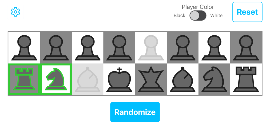
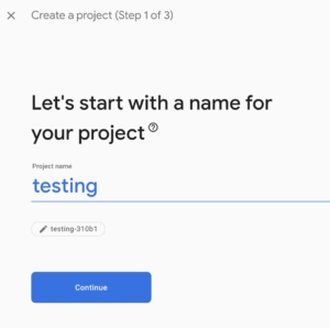
Use React Native to post to secure AWS API Gateway endpoint

I am setting up a React Native application that will interface with an authenticated API hosted by AWS API Gateway. Here is how I set up my API to be secured through authentication. I am not sure that this will be used in production, but it is working well for testing.

This post will go over the following:

  1. Setting up a very simple React Native application
  2. Adding a simple button that will later be used to get data from an endpoint
  3. Using the react-native-dotenv module for environment set up
  4. Using the react-native-aws-signature module for authorization
  5. Debugging with react-native-aws-signature

Here is the code for this example on githhub

Setting up a very simple React Native application

Start with a brand new react-native application. To set one up, run:

[~] $ react-native init SampleProject
[~] $ cd SampleProject
[~/SampleProject] $ react-native run-ios

You should get something in the simulator that looks like this:

Adding a simple button that will later be used to get data from an endpoint

In the index.ios.js file, add Button to the imports:

import {
  AppRegistry,
  StyleSheet,
  Text,
  View,
  Button
} from 'react-native';


Replace the existing SampleProject Component with this:

export default class SampleProject extends Component {
  constructor(props){
    super(props)

    this.state = {
      textToDisplay: 'no text yet' //state value that will display API response
    }
  }

  // Action that is called when button is pressed
  retrieveData() {
    this.setState({textToDisplay: "button pressed"})
  }

  render() {
    return (
      <View style={styles.container}>
        <Text style={styles.welcome}>
          Welcome to React Native!
        </Text>

        <Button
          onPress={() => this.retrieveData()}
          title="API request"
          color="#841584"
        />

        <Text>
          {this.state.textToDisplay}
        </Text>

      </View>
    );
  }
}

Reloading in the simulator should give you something like this:

If you press the ‘API Request’ link, you should get this:

Using the react-native-dotenv module for environment set up

In a production mobile application, you don’t want to save secret API keys anywhere in the code because it can be reverse engineered. There is a SO post here about it.

That being said, if you are only installing the app on your phone during the testing phase, it is probably fine.

The official react-native-dotenv instructions are here, but this is what I did to set it up.

First, install the module

npm install react-native-dotenv --save-dev

Add the react-native-dotenv preset to your .babelrc file at the project root.

{
  "presets": ["react-native", "react-native-dotenv"]
}

Create a .env file in your project root directory with your AWS credentials and the host.

# DO NOT use secret keys anywhere in your compiled code, even in .env files.
# You should use another method of authorization when this product goes to production
AWS_KEY=your key here
AWS_SECRET_KEY=your secret key here
AWS_REGION=us-west-2
API_STAGE=your api stage name here, mine is test
HOST=your host here, do not include the protocol (http:// or https://)

Now, let’s set up a really simple class that we will use to interface with our API. This should be at the same level as index.ios.js, and mine is called called SampleApi.js.

import { AWS_KEY, AWS_SECRET_KEY, HOST, AWS_REGION, API_STAGE} from 'react-native-dotenv'

class sampleApi {
  static get() {
    // Just return the host value to make sure our .env is working
    return HOST
  }
}

export default sampleApi


Then, somewhere near the top of index.ios.js, import the new class:

import sampleApi from "./SampleApi"

Replace the retrieveData function with:

retrieveData() {
  this.setState({textToDisplay: sampleApi.get()})
}


Our full index.ios.js should now look like:

/**
 * Sample React Native App
 * https://github.com/facebook/react-native
 * @flow
 */

import React, { Component } from 'react';
import {
  AppRegistry,
  StyleSheet,
  Text,
  View,
  Button
} from 'react-native';

import sampleApi from "./SampleApi"

export default class SampleProject extends Component {
  constructor(props){
    super(props)

    this.state = {
      textToDisplay: "not set" // state value that will display API response
    }
  }

  // Action that is called when button is pressed
  retrieveData() {
    this.setState({textToDisplay: sampleApi.get()})
  }

  render() {
    return (
      <View style={styles.container}>
        <Text style={styles.welcome}>
          Welcome to React Native!
        </Text>

        <Button
          onPress={() => this.retrieveData()}
          title="API request"
          color="#841584"
        />

        <Text>
          {this.state.textToDisplay}
        </Text>

      </View>
    );
  }
}

const styles = StyleSheet.create({
  container: {
    flex: 1,
    justifyContent: 'center',
    alignItems: 'center',
    backgroundColor: '#F5FCFF',
  },
  welcome: {
    fontSize: 20,
    textAlign: 'center',
    margin: 10,
  },
  instructions: {
    textAlign: 'center',
    color: '#333333',
    marginBottom: 5,
  },
});

AppRegistry.registerComponent('SampleProject', () => SampleProject);

Note: if you change the .env file only, the simulator will not recognize the change and your changes will not take affect.

Using the react-native-aws-signature module for authorization

Now, we want to actually hit the API when the button is pressed. Start by installing the react-native-aws-signature module

npm install react-native-aws-signature --save

In SampleApi.js, add the import for AWSSignature:

import AWSSignature from 'react-native-aws-signature'

Remove the contents of the get() method in SampleApi.js and start by setting up some variables based on the .env file:

static get() {
  const verb = 'get'
  // construct the url and path for our sample API
  const path = '/' + API_STAGE + '/pets'
  const url = 'https://' + HOST + path

  let credentials = {
    AccessKeyId: AWS_KEY,
    SecretKey: AWS_SECRET_KEY
  }
}

Next, set up the header and options. These will be used to generate the authorization details and they will be used in the request to the API.

let auth_date = new Date();

  let auth_header = {
    'Accept': 'application/json',
    'Content-Type': 'application/json',
    'dataType': 'json',
    'X-Amz-Date': auth_date.toISOString(),
    'host': HOST
  }

  let auth_options = {
    path: path,
    method: verb,
    service: 'execute-api',
    headers: auth_header,
    region: AWS_REGION,
    body: '',
    credentials
  };


Then, create a new AWSSignature object and call setParams. This will generate the authorization header, which we retrieve in the next bit of code:

  let awsSignature = new AWSSignature();
  awsSignature.setParams(auth_options);


Now, retrieve the authorization information and append it to our header.

  const authorization = awsSignature.getAuthorizationHeader();

  // Add the authorization to the header
  auth_header['Authorization'] = authorization['Authorization']

Finally, make the request to the API using the header we just created. We are expecting json back, and I have included some basic error checking.

let options = Object.assign({
  method: verb,
  headers: auth_header
});

return fetch(url, options).then( resp => {
  let json = resp.json();
  if (resp.ok) {
    return json
  }
  return json.then(err => {throw err});
})

Here is what the SampleApi.js file should now look like:

import AWSSignature from 'react-native-aws-signature'
import { AWS_KEY, AWS_SECRET_KEY, HOST, AWS_REGION, API_STAGE} from 'react-native-dotenv'

class sampleApi {

  static get() {
    const verb = 'get'
    // construct the url and path for our sample API
    const path = '/' + API_STAGE + '/pets'
    const url = 'https://' + HOST + path

    let credentials = {
      AccessKeyId: AWS_KEY,
      SecretKey: AWS_SECRET_KEY
    }

    let auth_date = new Date();

    let auth_header = {
      'Accept': 'application/json',
      'Content-Type': 'application/json',
      'dataType': 'json',
      'X-Amz-Date': auth_date.toISOString(),
      'host': HOST
    }

    let auth_options = {
      path: path,
      method: verb,
      service: 'execute-api',
      headers: auth_header,
      region: AWS_REGION,
      body: '',
      credentials
    };

    let awsSignature = new AWSSignature();
    awsSignature.setParams(auth_options);

    const authorization = awsSignature.getAuthorizationHeader();

    // Add the authorization to the header
    auth_header['Authorization'] = authorization['Authorization']

    let options = Object.assign({
      method: verb,
      headers: auth_header
    });

    return fetch(url, options).then( resp => {
      let json = resp.json();
      if (resp.ok) {
        return json
      }
      return json.then(err => {throw err});
    })
  }
}

export default sampleApi


Modify index.ios.js to set the state to include the return value of the request. Since we are getting a json array back, we have to loop through it to make a readable text block:

// Action that is called when button is pressed
retrieveData() {
  sampleApi.get().then(resp => {
    tempText = ""
    // we will get an array back, so loop through it
    resp.forEach(function(pet) {
      tempText += JSON.stringify(pet) + "\n"
    })

    // update our state to include the new text  
    this.setState({textToDisplay: tempText})
  })
}

After you refresh the simulator, you should be able to press the button and receive a screen that looks something like this:

Debugging with react-native-aws-signature

This AWS troubleshooting guide is helpful, but react-native-aws-signature does most of the work for you, so it can be difficult to determine where your mistakes are.

I got this error when I was including the https:// at the beginning of the host parameter in the header. The full error includes what AWS was expecting for the ‘canonical string’ and the ‘string to sign’.

The request signature we calculated does not match the signature you provided. Check your AWS Secret Access Key and signing method.

I figured out how to fix the issue by using the getCanonicalString() and getStringToSign() methods.

var awsSignature = new AWSSignature();

// Set up the params here as described above

console.log("canonical string")
console.log(awsSignature.getCanonicalString())
console.log("string to sign")
console.log(awsSignature.getStringToSign())

Create secure endpoints for AWS API Gateway

I am building an application that will rely on the AWS API Gateway for a REST API. I want to make sure that other people are not able to read or write data on the endpoints. I will be using IAM authentication, using the steps below:

  1. Set up an example API
  2. Test that the API works without authorization
  3. Enable authorization on your endpoints
  4. Set up a new User in IAM for API requests
  5. Configure your request to use your credentials

Set up an example API

If you already have an API set up, skip this part.

From API Gateway, select “Create API”.


On the next screen select “Example API” and click “Import”.


The UI will then prompt you to “Deploy API”, if it doesn’t, you can select the option from the “Actions” dropdown. You must provide a stage name for the deploy, I just used ‘test’.


After you have deployed the API, you should see a screen like this, that includes a link to the API.

Click on the link and it will bring you to an info page. We will test the endpoint in the next step.

Test that the API works without auth

Now, make sure you can get to your endpoints without authentication. You can test the GET endpoint by appending ‘/pets’ to your url, either in a browser or with an application like Postman.

The browser output will look something like this:

The Postman output will look something like this:

postman response

Enable authorization on your endpoints

Now, let’s lock down the API so only we can get to it. In API gateway, select the /pets GET resource:

Then go to the configs for the Method Request and select ‘AWS_IAM’ under the Authorization setting.


In order for the changes to take affect, you have to use the “Deploy API” action under the “Actions” dropdown. You can deploy over an existing stage, or create a new one.

Now when you try to hit the endpoint via the url, you should get this response

{"message":"Missing Authentication Token"}

Set up new User in IAM for API requests

Go to your IAM setup and add a new group with the following permissions: AmazonAPIGatewayInvokeFullAccess

Set up a new user that is a part of the group you just created. You won’t need to log in as that user, so don’t set up a password.

On the last screen, the credentials will be provided, make sure you capture both the Access Key ID and the Secret access key, the secret key won’t be displayed again.

Configure your request to use your credentials

In order to get to our endpoint, we need to include authorization values in the header. These are calculated at the time of the request to make sure other people cannot just reuse your headers to gain access.

Here are the full instructions from Amazon, but Postman makes it pretty easy.

Under the “Authorization” tab, select “AWS Signature”

You will be taken to this screen where you can enter the configuration:

The configuration includes:

  • AccessKey – This is the Access Key ID that we copied in the previous step, it is the shorter of the keys
  • SecretKey – This is the “Secret Access Key” that was copied in the previous step, it is the longer of the keys. (It should never be shared)
  • AWS Region – This is ‘us-west-2’ for me, but may be different for you
  • Service Name – this should be ‘execute-api’

After you have entered the values, press “Update Request”. Now if you try to access the endpoint, you should get the data as before.

Check out the values that were included in the “Headers” tab. The X-Amz-Date and Authorization will change with each request and they are what Amazon verifies on their end to ensure you have up to date permissions.


Next Steps

In order to use the API from an application, you will need to systematically add the headers to your requests. I am using react-native-aws-signature for my React Native application.